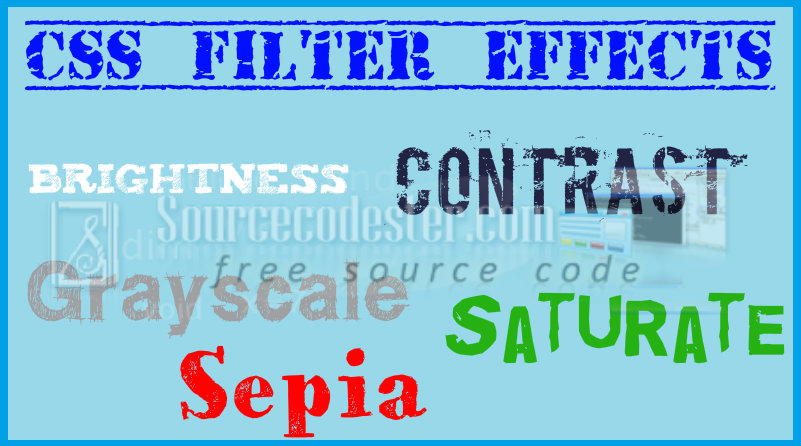
CSS Filter Effects: Brightness, Contrast, Grayscale, Saturate, and Sepia Part I
Submitted by alpha_luna on Monday, July 18, 2016 - 12:54.
If you are looking for about CSS Filter Effects then you are at the right place. Filters effect was primarily part of the SVG or it’s called Scalable Vector Graphics. Short information about SVG, SVG is a markup language that describes the two-dimensional graphics kind of application or an image and it is a set of related graphics script interfaces. CSS filter effect is easy to use, you can use this kind of effect to become more attractive the image or any graphics application to attract the user.
And, this is the simple syntax to apply the filter effect in CSS:
 Source code for the filter effect of brightness in the image above.
 Source code for the filter effect of contrast in the image above.
 Source code for the filter effect of grayscale in the image above.
 Source code for the filter effect of saturates in the image above.
 Source code for the filter effect of sepia in the image above.
Hope that this tutorial will help you a lot.
If you are interested in programming, we have an example of programs that may help you even just in small ways. If you want more tutorials, you can visit our website, click here.
Share us your thoughts and comments below. Thank you so much for dropping by and reading this tutorial post. For more updates, don’t hesitate and feel free to visit this website more often and please share this with your friends or email me at [email protected]. Practice Coding. Thank you very much.
Source code for the filter effect of sepia in the image above.
Hope that this tutorial will help you a lot.
If you are interested in programming, we have an example of programs that may help you even just in small ways. If you want more tutorials, you can visit our website, click here.
Share us your thoughts and comments below. Thank you so much for dropping by and reading this tutorial post. For more updates, don’t hesitate and feel free to visit this website more often and please share this with your friends or email me at [email protected]. Practice Coding. Thank you very much.
filter: none | blur() | brightness() | contrast() | drop-shadow() | grayscale() | hue-rotate() | invert() | opacity() | saturate() | sepia() | url();
Short discussions in the filter function.
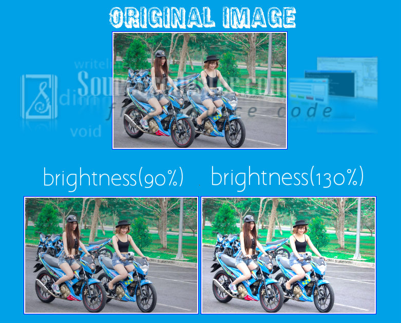
Brightness
This one sample of filter effects it controls the brightness of the image. The original image gives a 100% brightness of the image. In our example, we have 90% and 130% of brightness in the image below. If the brightness of the image is 0% it will automatically black.
Source code for the filter effect of brightness in the image above.
HTML Code
- <img src="http://motardes.e-monsite.com/medias/images/suzuki-raider-150-biker-girls-1506145.jpg">
- <img src="http://motardes.e-monsite.com/medias/images/suzuki-raider-150-biker-girls-1506145.jpg" class="img_style_1">
- <img src="http://motardes.e-monsite.com/medias/images/suzuki-raider-150-biker-girls-1506145.jpg" class="img_style_2">
CSS Style
- h2 {
- margin: 20px;
- padding-top: 20px;
- clear:both;
- }
- img {
- max-width: 25%;
- margin: 0 auto;
- padding: 2px;
- border:1px solid blue;
- }
- .img_style_1 {
- -webkit-filter: brightness(90%);
- filter: brightness(90%);
- }
- .img_style_2 {
- -webkit-filter: brightness(130%);
- filter: brightness(130%);
- }
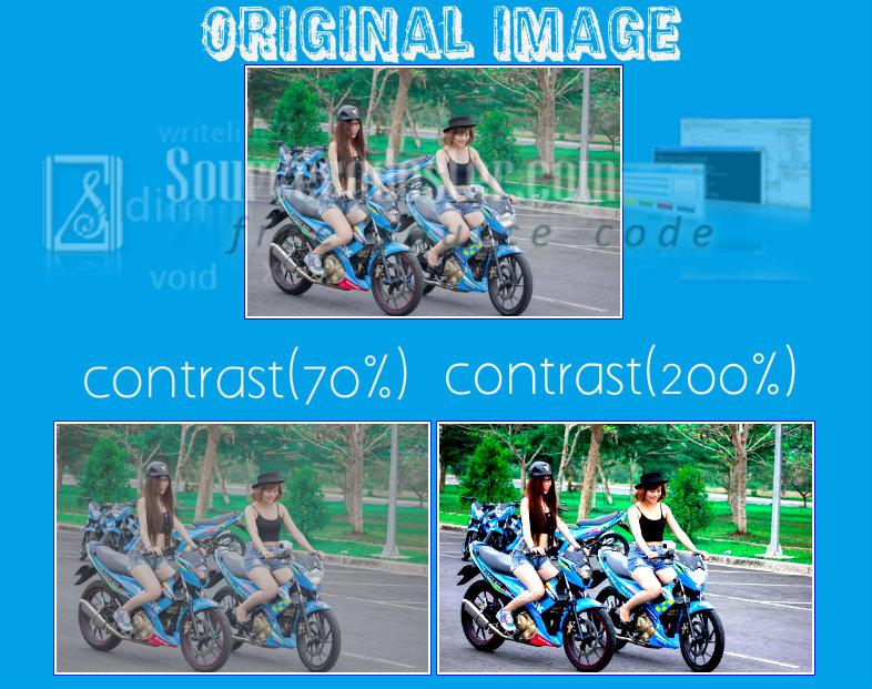
Contrast
This one sample of filter effects it controls the contrast of the image. This contrast effect controls the dark and light side of the image in CSS. In our example, we have 70% and 200% of contrast in the image below. If the contrast of the image is 0% it will automatically black.
Source code for the filter effect of contrast in the image above.
HTML Code
- <img src="http://motardes.e-monsite.com/medias/images/suzuki-raider-150-biker-girls-1506145.jpg">
- <img src="http://motardes.e-monsite.com/medias/images/suzuki-raider-150-biker-girls-1506145.jpg" class="img_style_1">
- <img src="http://motardes.e-monsite.com/medias/images/suzuki-raider-150-biker-girls-1506145.jpg" class="img_style_2">
CSS Code
- h2 {
- margin: 20px;
- padding-top: 20px;
- clear:both;
- }
- img {
- max-width: 25%;
- margin: 0 auto;
- padding: 2px;
- border:1px solid blue;
- }
- .img_style_1 {
- -webkit-filter: contrast(70%);
- filter: contrast(70%);
- }
- .img_style_2 {
- -webkit-filter: contrast(200%);
- filter: contrast(200%);
- }
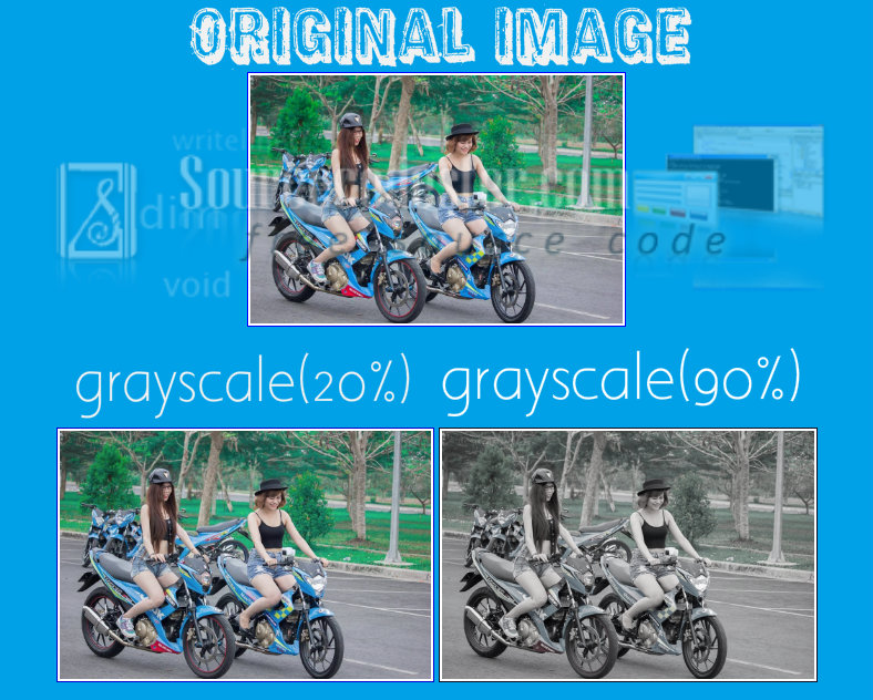
Grayscale
This one sample of filter effects it converts the image to grayscale . The default is 0% and it will represent the original image. In our example, we have 20% and 90% of grayscale in the image below.
Source code for the filter effect of grayscale in the image above.
HTML Code
- <img src="http://motardes.e-monsite.com/medias/images/suzuki-raider-150-biker-girls-1506145.jpg">
- <img src="http://motardes.e-monsite.com/medias/images/suzuki-raider-150-biker-girls-1506145.jpg" class="img_style_1">
- <img src="http://motardes.e-monsite.com/medias/images/suzuki-raider-150-biker-girls-1506145.jpg" class="img_style_2">
CSS Code
- h2 {
- margin: 20px;
- padding-top: 20px;
- clear:both;
- }
- img {
- max-width: 25%;
- margin: 0 auto;
- padding: 2px;
- border:1px solid blue;
- }
- .img_style_1 {
- -webkit-filter: grayscale(20%);
- filter: grayscale(20%);
- }
- .img_style_2 {
- -webkit-filter: grayscale(90%);
- filter: grayscale(90%);
- }
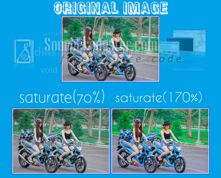
Saturate
This one sample of filter effects it controls the saturation of the image. If the value is 0% of this kind of filter effects, it will completely remove all the colors of the image and if the value over 100% the image become super saturated. The negative value is not allowed of this kind of filter effect. In our example, we have 70% and 170% of saturating in the image below.
Source code for the filter effect of saturates in the image above.
HTML Code
- <img src="http://motardes.e-monsite.com/medias/images/suzuki-raider-150-biker-girls-1506145.jpg">
- <img src="http://motardes.e-monsite.com/medias/images/suzuki-raider-150-biker-girls-1506145.jpg" class="img_style_1">
- <img src="http://motardes.e-monsite.com/medias/images/suzuki-raider-150-biker-girls-1506145.jpg" class="img_style_2">
CSS Code
- h2 {
- margin: 20px;
- padding-top: 20px;
- clear:both;
- }
- img {
- max-width: 25%;
- margin: 0 auto;
- padding: 2px;
- border:1px solid blue;
- }
- .img_style_1 {
- -webkit-filter: saturate(70%);
- filter: saturate(70%);
- }
- .img_style_2 {
- -webkit-filter: saturate(170%);
- filter: saturate(170%);
- }
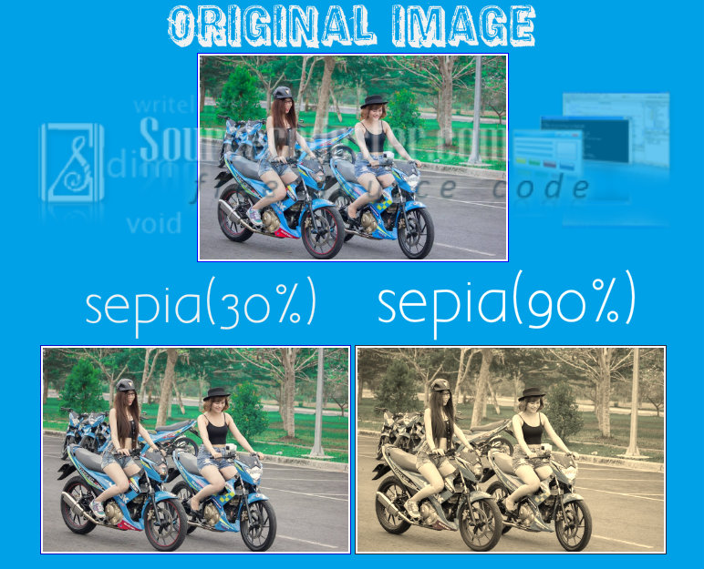
Sepia
This one sample of filter effects adds a sepia to an image to look like old images. The default value is 0% of this kind of filter effects, if the value is 100% the image will become a sepia. In our example, we have 30% and 90% of sepia in the image below.
Source code for the filter effect of sepia in the image above.
HTML Code
- <img src="http://motardes.e-monsite.com/medias/images/suzuki-raider-150-biker-girls-1506145.jpg">
- <img src="http://motardes.e-monsite.com/medias/images/suzuki-raider-150-biker-girls-1506145.jpg" class="img_style_1">
- <img src="http://motardes.e-monsite.com/medias/images/suzuki-raider-150-biker-girls-1506145.jpg" class="img_style_2">
CSS Code
- h2 {
- margin: 20px;
- padding-top: 20px;
- clear:both;
- }
- img {
- max-width: 25%;
- margin: 0 auto;
- padding: 2px;
- border:1px solid blue;
- }
- .img_style_1 {
- -webkit-filter: sepia(30%);
- filter: sepia(30%);
- }
- .img_style_2 {
- -webkit-filter: sepia(90%);
- filter: sepia(90%);
- }