CSS Geometric Shapes
Submitted by alpha_luna on Friday, April 8, 2016 - 16:42.
We all know that CSS stands for (Cascading Style Sheets). It can manage the layout of your multifarious web pages at once… And it saves a lot of jobs.
In this tutorial, we are going to learn about on CSS Geometric Shapes. We can make it without using images. Most of them are draw using CSS. This is for the beginners. Hope you can learn from it.
This is the example of Geometric Shapes:
This is the result of the CSS code above:
 This is the result of the CSS code above:
 This is the result of the CSS code above:
 This is the result of the CSS code above:
 This is the result of the CSS code above:
 This is the result of the CSS code above:
 Triangle Side
This is the result of the CSS code above:
Triangle Side
This is the result of the CSS code above:
 This is the result of the CSS code above:
 CSS
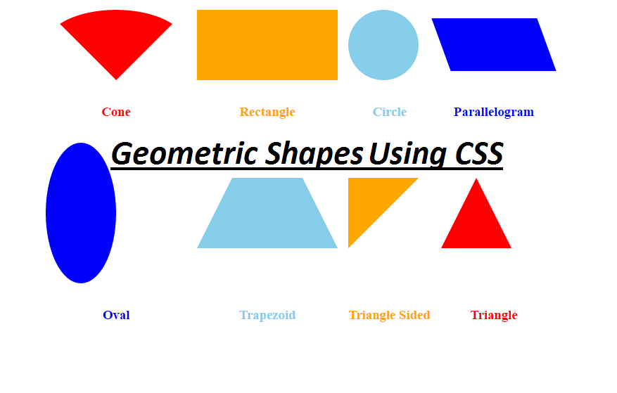
And, this is the example of Geometric Shapes Using CSS and you can create more abstract shapes when you blend this kind of example.
Share us your thoughts and comments below. Thank you so much for dropping by and reading this blog post. For more updates, don’t hesitate and feel free to visit our website more often and please share this with your friends or email me at [email protected]. Practice Coding. Thank you.
CSS
And, this is the example of Geometric Shapes Using CSS and you can create more abstract shapes when you blend this kind of example.
Share us your thoughts and comments below. Thank you so much for dropping by and reading this blog post. For more updates, don’t hesitate and feel free to visit our website more often and please share this with your friends or email me at [email protected]. Practice Coding. Thank you.
- Cone
- Rectangle
- Circle
- Parallelogram
- Oval
- Trapezoid
- Triangle Sided
- Triangle
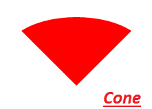
Cone
- .css_cone {
- border-left: 100px solid transparent;
- border-right: 100px solid transparent;
- border-top: 100px solid red;
- -moz-border-radius: 50%;
- -webkit-border-radius: 50%;
- border-radius: 50%;
- }
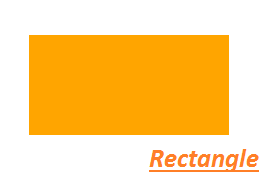
Rectangle
- .css_rectangle {
- height: 100px;
- width: 200px;
- background: orange;
- }
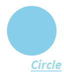
Circle
- .css_circle {
- width: 100px;
- height: 100px;
- background: skyblue;
- -moz-border-radius: 50px;
- -webkit-border-radius: 50px;
- border-radius: 50px;
- }
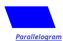
Parallelogram
- .css_parallelogram {
- height: 75px;
- width: 150px;
- background: blue;
- -webkit-transform: skew(20deg);
- -moz-transform: skew(20deg);
- -o-transform: skew(20deg);
- transform: skew(20deg);
- }
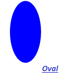
Oval
- .css_oval {
- height: 200px;
- width: 100px;
- background: blue;
- -moz-border-radius: 50%;
- -webkit-border-radius: 50%;
- border-radius: 50%;
- }
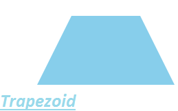
Trapezoid
- .css_trapezoid {
- height: 0;
- width: 100px;
- border-bottom: 100px solid skyblue;
- border-left: 50px solid transparent;
- border-right: 50px solid transparent;
- }
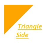
Triangle Side
- .css_triangle_side {
- height: 0;
- width: 0;
- border-top: 100px solid orange;
- border-right: 100px solid transparent;
- }
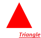
Triangle
- .css_triangle {
- height: 0;
- width: 0;
- border-left: 50px solid transparent;
- border-right: 50px solid transparent;
- border-bottom: 100px solid red;
- }
All source code:
HTML- <center>
- <table style="text-align:center; margin:50px;" cellpadding="5" cellspacing="5">
- <tr>
- <td>
- </td>
- <td>
- </td>
- <td>
- </td>
- <td>
- </td>
- </tr>
- <tr>
- <td>
- </td>
- <td>
- </td>
- <td>
- </td>
- <td>
- </td>
- </tr>
- <tr>
- <td>
- </td>
- <td>
- </td>
- <td>
- </td>
- <td>
- </td>
- </tr>
- <tr>
- <td>
- </td>
- <td>
- </td>
- <td>
- </td>
- <td>
- </td>
- </tr>
- </table>
- </center>
- <style type="text/css">
- .css_cone {
- border-left: 100px solid transparent;
- border-right: 100px solid transparent;
- border-top: 100px solid red;
- -moz-border-radius: 50%;
- -webkit-border-radius: 50%;
- border-radius: 50%;
- }
- .css_rectangle {
- height: 100px;
- width: 200px;
- background: orange;
- }
- .css_circle {
- width: 100px;
- height: 100px;
- background: skyblue;
- -moz-border-radius: 50px;
- -webkit-border-radius: 50px;
- border-radius: 50px;
- }
- .css_parallelogram {
- height: 75px;
- width: 150px;
- background: blue;
- -webkit-transform: skew(20deg);
- -moz-transform: skew(20deg);
- -o-transform: skew(20deg);
- transform: skew(20deg);
- }
- .css_oval {
- height: 200px;
- width: 100px;
- background: blue;
- -moz-border-radius: 50%;
- -webkit-border-radius: 50%;
- border-radius: 50%;
- }
- .css_trapezoid {
- height: 0;
- width: 100px;
- border-bottom: 100px solid skyblue;
- border-left: 50px solid transparent;
- border-right: 50px solid transparent;
- }
- .css_triangle_side {
- height: 0;
- width: 0;
- border-top: 100px solid orange;
- border-right: 100px solid transparent;
- }
- .css_triangle {
- height: 0;
- width: 0;
- border-left: 50px solid transparent;
- border-right: 50px solid transparent;
- border-bottom: 100px solid red;
- }
- </style>