Responsive Websites Using Queries
Submitted by Yorkiebar on Tuesday, January 28, 2014 - 17:20.
Introduction:
This page will be covering responsive designs using media queries.
What Are Responsive Websites?
Responsive websites are ones which adjust their elements to fit correctly within the screen of the device being used to view the page on. Instead of having to create different versions of a page for mobiles, tablets and computers, you can use simple media queries to easily adjust one page to display nicely on screens of all sizes.
Structure:
@media only screen and {screen sizes} {
// Styling goes in here.
}
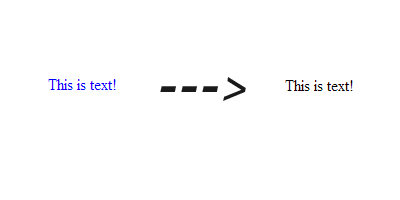
Example:
Possible Media Queries:
As well as using the screen property (which we are going to be using to get the responsive website) there are also other media queries that can be used within CSS...
all - Used for all media type devices.
aural - Used for speech and sound synthesizers.
braille - Used for braille tactile feedback devices.
embossed - Used for paged braille printers.
handheld - Used for small or handheld devices.
print - Used for printers.
projection - Used for projected presentations, like slides.
screen - Used for computer screens.
tty - Used for media using a fixed-pitch character grid, like teletypes and terminals.
tv - Used for television-type devices.
Linking CSS To a HTML Element:
To link your CSS to an HTML element (text, div, etc.) you will need to decide whether you want to use a class or id, you will also need a unique name. Once you have those, go to your element in HTML and add...
... to the attributes of that element if you chose a class, or...
if you chose an id.
Make sure you replace 'myClass' and/or 'myID' with your unique name. Then, in the CSS you will want to encase your properties with...
if you chose a class, or...
(You can remove the line beginning with // if you wish).
Here's an example...
By putting our responsive queries at the bottom of the page, we ensure that any properties we have set prior to the queries are overwritten.
- @media only screen and (max-width: 600px){
- // Styling goes in here.
- }
- class='myClass'
- id='myID'
- .myClass {
- //Properties go here
- }
- #myID {
- //Properties go here
- }
- <html>
- <head>
- <style>
- .myDiv {
- color: blue;
- width: 300px;
- height: 100px;
- // Blue text and 300px width for a screen bigger than 600 pixels.
- }
- @media only screen and (max-width: 600px){
- .myDiv {
- color: black;
- width: 100%;
- height: 100px;
- // Black text and full width for a mobile.
- }
- }
- </style>
- </head>
- <body>
- <div class='myDiv'>This is text!</div>
- </body>
- </html>