CSS Filter Effects: Hue-rotate, Invert, Blur, Opacity, and Drop Shadow Part II
Submitted by alpha_luna on Monday, July 18, 2016 - 15:48.
In this tutorial, we are going to learn about CSS Filter Effects: Hue-rotate, Invert, Blur, Opacity, and Drop Shadow. This is the continuation of CSS Filter Effects: Brightness, Contrast, Grayscale, Saturate, and Sepia Part I tuorial.
And, this is the simple syntax to apply the filter effect in CSS:
 Source code for the filter effect of hue-rotate in the image above.
 Source code for the filter effect of invert in the image above.
 Source code for the filter effect of blur in the image above.
 Source code for the filter effect of opacity in the image above.
 Source code for the filter effect of a drop shadow in the image above.
Related Code: CSS Filter Effects: Brightness, Contrast, Grayscale, Saturate, and Sepia Part I
Kindly click the "Download Code" button below for full source code. Thank you very much.
Hope that this tutorial will help you a lot.
Share us your thoughts and comments below. Thank you so much for dropping by and reading this tutorial post. For more updates, don’t hesitate and feel free to visit this website more often and please share this with your friends or email me at [email protected]. Practice Coding. Thank you very much.
Source code for the filter effect of a drop shadow in the image above.
Related Code: CSS Filter Effects: Brightness, Contrast, Grayscale, Saturate, and Sepia Part I
Kindly click the "Download Code" button below for full source code. Thank you very much.
Hope that this tutorial will help you a lot.
Share us your thoughts and comments below. Thank you so much for dropping by and reading this tutorial post. For more updates, don’t hesitate and feel free to visit this website more often and please share this with your friends or email me at [email protected]. Practice Coding. Thank you very much.
filter: none | blur() | brightness() | contrast() | drop-shadow() | grayscale() | hue-rotate() | invert() | opacity() | saturate() | sepia() | url();
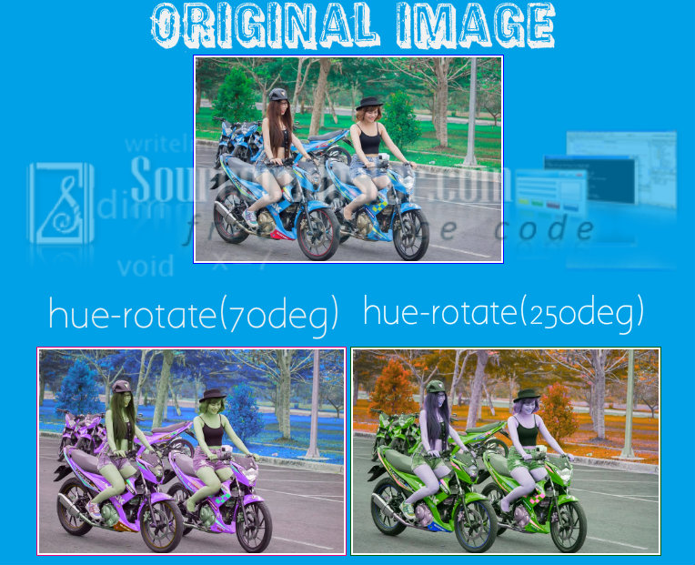
Hue-rotate
This one sample of filter effects applies hue-rotation to all colors of the image. The default value is 0deg and that's the original image. In our example, we have 70deg and 250deg of hue-rotation in the image below.
Source code for the filter effect of hue-rotate in the image above.
HTML Code
- <img src="http://motardes.e-monsite.com/medias/images/suzuki-raider-150-biker-girls-1506145.jpg">
- <img src="http://motardes.e-monsite.com/medias/images/suzuki-raider-150-biker-girls-1506145.jpg" class="img_style_1">
- <img src="http://motardes.e-monsite.com/medias/images/suzuki-raider-150-biker-girls-1506145.jpg" class="img_style_2">
CSS Code
- h2 {
- margin: 20px;
- padding-top: 20px;
- clear:both;
- }
- img {
- max-width: 25%;
- margin: 0 auto;
- padding: 2px;
- border:1px solid blue;
- }
- .img_style_1 {
- -webkit-filter: hue-rotate(70deg);
- filter: hue-rotate(70deg);
- }
- .img_style_2 {
- -webkit-filter: hue-rotate(250deg);
- filter: hue-rotate(250deg);
- }
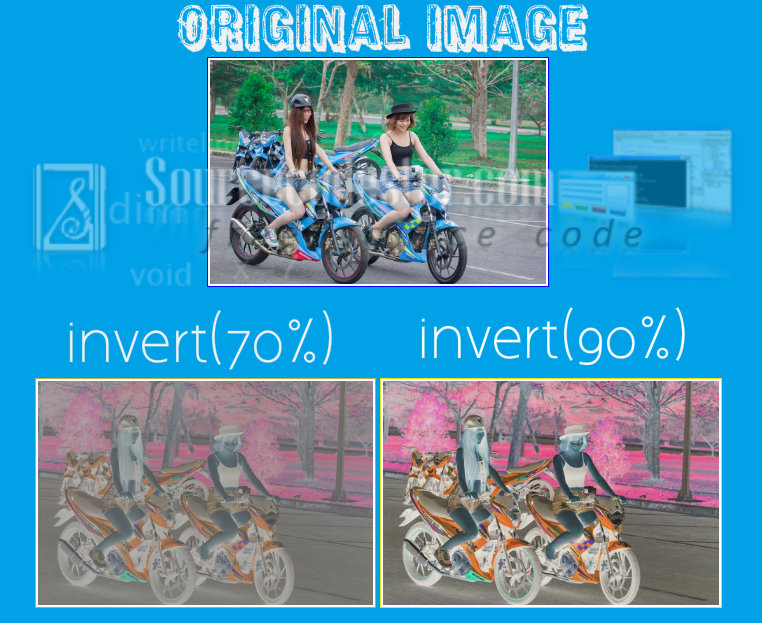
Invert
This one sample of filter effects inverts all the colors in the image. If your value is 0% it will not effect to the original image while if you have 100% it will completely invert the image. In our example, we have 70% and 90% of invert in the image below.
Source code for the filter effect of invert in the image above.
HTML Code
- <img src="http://motardes.e-monsite.com/medias/images/suzuki-raider-150-biker-girls-1506145.jpg">
- <img src="http://motardes.e-monsite.com/medias/images/suzuki-raider-150-biker-girls-1506145.jpg" class="img_style_1">
- <img src="http://motardes.e-monsite.com/medias/images/suzuki-raider-150-biker-girls-1506145.jpg" class="img_style_2">
CSS Code
- h2 {
- margin: 20px;
- padding-top: 20px;
- clear:both;
- }
- img {
- max-width: 25%;
- margin: 0 auto;
- padding: 2px;
- border:1px solid blue;
- }
- .img_style_1 {
- -webkit-filter: invert(70%);
- filter: invert(70%);
- }
- .img_style_2 {
- -webkit-filter: invert(90%);
- filter: invert(90%);
- }
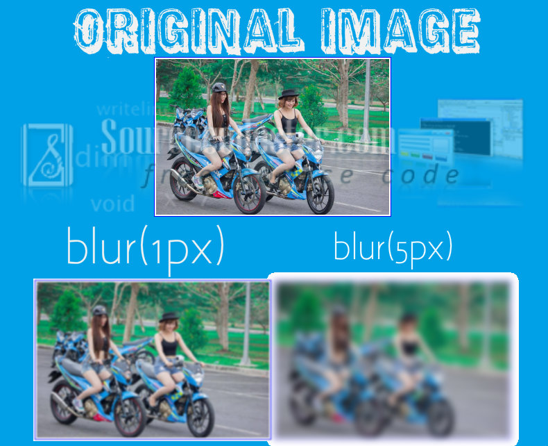
Blur
This one sample of filter effects applies a blur to the image. This filter effect it determines how many pixels on the image blend into each other. If the value is large it will more blur to the image. In our example, we have 1px and 5px of blur in the image below.
Source code for the filter effect of blur in the image above.
HTML Code
- <img src="http://motardes.e-monsite.com/medias/images/suzuki-raider-150-biker-girls-1506145.jpg">
- <img src="http://motardes.e-monsite.com/medias/images/suzuki-raider-150-biker-girls-1506145.jpg" class="img_style_1">
- <img src="http://motardes.e-monsite.com/medias/images/suzuki-raider-150-biker-girls-1506145.jpg" class="img_style_2">
CSS Code
- h2 {
- margin: 20px;
- padding-top: 20px;
- clear:both;
- }
- img {
- max-width: 25%;
- margin: 0 auto;
- padding: 2px;
- border:1px solid blue;
- }
- .img_style_1 {
- -webkit-filter: blur(1px);
- filter: blur(1px);
- }
- .img_style_2 {
- -webkit-filter: blur(5px);
- filter: blur(5px);
- }
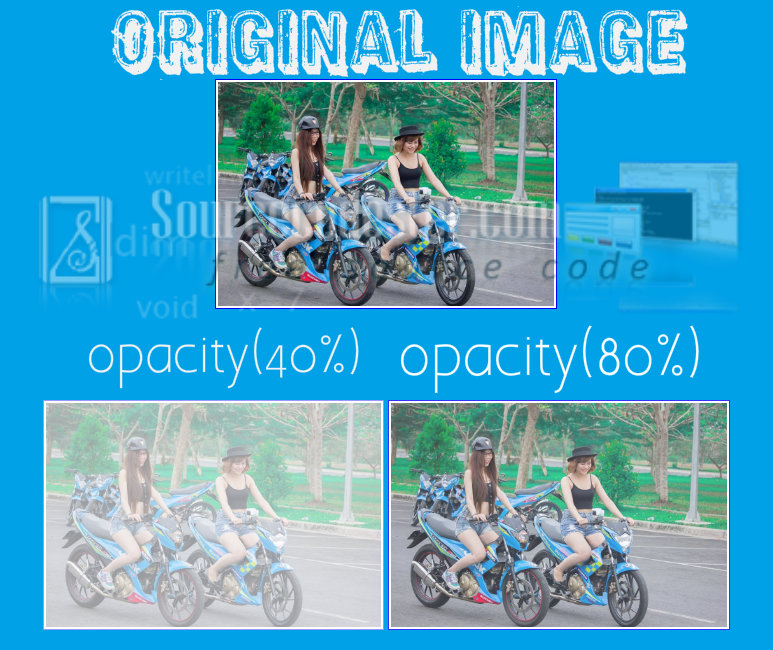
Opacity
This one sample of filter effects applies an opacity to the image to make it semi-transparent. If the value is 100% the image will become opaque, if the value is 0% it will become fully transparent. In our example, we have 40% and 80% of opacity in the image below.
Source code for the filter effect of opacity in the image above.
HTML Code
- <img src="http://motardes.e-monsite.com/medias/images/suzuki-raider-150-biker-girls-1506145.jpg">
- <img src="http://motardes.e-monsite.com/medias/images/suzuki-raider-150-biker-girls-1506145.jpg" class="img_style_1">
- <img src="http://motardes.e-monsite.com/medias/images/suzuki-raider-150-biker-girls-1506145.jpg" class="img_style_2">
CSS Code
- h2 {
- margin: 20px;
- padding-top: 20px;
- clear:both;
- }
- img {
- max-width: 25%;
- margin: 0 auto;
- padding: 2px;
- border:1px solid blue;
- }
- .img_style_1 {
- -webkit-filter: opacity(40%);
- filter: opacity(40%);
- }
- .img_style_2 {
- -webkit-filter: opacity(80%);
- filter: opacity(80%);
- }
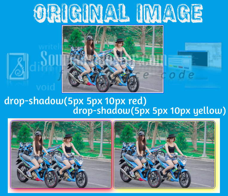
Drop Shadow
This one sample of filter effects adds drop shadow effect to images. This kind of property it required to have an X and the Y offset as well as the color of the drop shadow. In our example, we have 40% and 80% of opacity in the image below.
Source code for the filter effect of a drop shadow in the image above.
HTML Code
- <img src="http://motardes.e-monsite.com/medias/images/suzuki-raider-150-biker-girls-1506145.jpg">
- <img src="http://motardes.e-monsite.com/medias/images/suzuki-raider-150-biker-girls-1506145.jpg" class="img_style_1">
- <img src="http://motardes.e-monsite.com/medias/images/suzuki-raider-150-biker-girls-1506145.jpg" class="img_style_2">
CSS Code
- h2 {
- margin: 20px;
- padding-top: 20px;
- clear:both;
- }
- img {
- max-width: 25%;
- margin: 0 auto;
- padding: 2px;
- border:1px solid blue;
- }
- .img_style_1 {
- -webkit-filter: drop-shadow(5px 5px 10px red);
- filter: drop-shadow(5px 5px 10px #666);
- border-radius: 10px;
- }
- .img_style_2 {
- -webkit-filter: drop-shadow(5px 5px 10px yellow);
- filter: drop-shadow(5px 5px 10px #666);
- border-radius: 10px;
- }