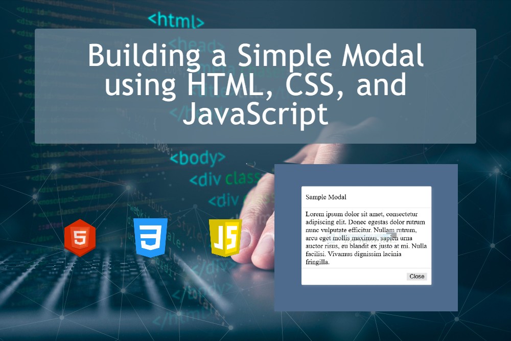
Building a Simple Modal using HTML, CSS, and JavaScript
In this tutorial, we will learn how to create a simple yet highly usable feature that can be integrated into any web application project. We will build a Simple Modal using HTML, CSS, and JavaScript. A modal window is one of the most commonly used components in modern web design and development because it enhances user interaction without requiring page reloads or redirects.
What is a Modal?
In a web application, a modal is a popup user interface element that appears on top of the main content. Typically, the background content is dimmed or disabled, directing the user’s focus to the modal itself. The modal remains open until the user either closes it or performs a required action. This makes modals an effective way to capture attention and streamline user interaction.
Modals are commonly used for:
- Login or Sign-up Forms – Quickly prompt users to authenticate without navigating away from the current page.
- Alerts or Confirmations – Display important notifications, warnings, or confirmation messages before proceeding with an action.
- Displaying Additional Information – Show more details about a product, service, or feature without cluttering the main page layout.
- Other Pop-up Forms – Collect user feedback, subscriptions, or other inputs in a seamless and user-friendly way.
By the end of this tutorial, you will have a fully functional modal that you can easily reuse and customize in any web application project.
What Do We Need?
To create the Simple Modal, we only need the following tools:
- Code Editor – such as Sublime Text or Visual Studio Code (VS Code) to write and edit the code.
- Web Browser – such as Google Chrome, to open the page and test the modal functionality.
Let's get started...
We will now build a simple web application that contains a functional modal window and buttons to trigger its show/hide behavior.
Step 1: Creating the Interface
First, let's create a new HTML file and save it as index.html. This file will contain the core HTML structure, including the modal elements and the buttons that trigger it. We will also link the external CSS and JavaScript (JS) files in this HTML file, which will be explained further in the next steps.
- <!DOCTYPE html>
- <html lang="en">
- <head>
- <meta charset="UTF-8">
- <meta name="viewport" content="width=device-width, initial-scale=1.0">
- <link rel="stylesheet" href="style.css">
- </head>
- <body>
- <!-- Page Wrapper -->
- <div id="wrapper">
- <!-- Modal Trigger Button -->
- </div>
- <!-- Page Wrapper -->
- <!-- Modal -->
- <div id="modal">
- <!-- Modal Container -->
- <div class="modal-container">
- <!-- Modal Header -->
- <div class="modal-header">
- </div>
- <!-- Modal Header -->
- <!-- Modal Body -->
- <div class="modal-body">
- </div>
- <!-- Modal Body -->
- <!-- Modal Footer -->
- <div class="modal-footer">
- <!-- Modal Close Button -->
- </div>
- <!-- Modal Footer -->
- <!-- Modal Container -->
- </div>
- </div>
- <!-- Modal -->
- </body>
- </html>
Step 2: Designing the Interface
Next, let's create a new Cascading Style Sheets (CSS) file and save it as style.css. This stylesheet will define the structure, layout, and overall design of the application’s interface. By styling the elements properly, the style.css file makes the web application look more professional, visually appealing, and user-friendly.
- * {
- box-sizing: border-box;
- }
- html,
- body{
- margin: unset;
- padding: 10px 20px;
- background-color: #6D94C5;
- height: 100%;
- width: 100%;
- }
- /* Main Wrapper */
- #wrapper{
- height: 100%;
- width: 100%;
- display: flex;
- flex-flow: column wrap;
- align-items: center;
- justify-content: center;
- }
- /* Trigger Button */
- #show-btn{
- width: 150px;
- padding: 5px 3px;
- border-radius: 3px;
- outline: none;
- border: unset;
- box-shadow: 3px 5px 7px #00000050;
- cursor: pointer;
- }
- #show-btn:hover,
- #show-btn:active{
- transform: scale(1.1);
- }
- /* Modal */
- #modal{
- position: fixed;
- top: 0;
- left: 0;
- width: 100%;
- height: 100%;
- overflow: auto;
- display: flex;
- flex-flow: row wrap;
- align-items: center;
- justify-content: center;
- transition: all .3s ease-in-out;
- transform: translateY(-1000px);
- }
- /* Modal Container */
- #modal .modal-container{
- width: 300px;
- background-color: #fff;
- border-radius: 3px;
- box-shadow: 3px 3px 5px #ffffff1d;
- }
- /* Modal Header */
- #modal .modal-container .modal-header{
- display: flex;
- flex-flow: row wrap;
- width: 100%;
- padding: 15px 10px;
- border-bottom: 1px solid #0000001a;
- }
- /* Modal Body */
- #modal .modal-container .modal-body{
- width: 100%;
- padding: 5px 10px;
- }
- /* Modal Footer */
- #modal .modal-container .modal-footer{
- display: flex;
- flex-flow: row-reverse wrap;
- width: 100%;
- padding: 10px 10px;
- border-top: 1px solid #0000001a;
- }
- /* Close Button */
- #close-btn{
- outline: none;
- border: unset;
- background-color: #e4e4e4;
- cursor: pointer;
- }
- #close-btn:hover,
- #close-btn:active{
- transform: scale(1.05);
- }
- /* Show Modal */
- #modal.show{
- transform: translateX(0);
- }
Step 3: Creating the Functionality
Lastly, let's create a new JavaScript file and save it as script.js. This file contains the JavaScript code that makes our modal fully functional. It includes the event listeners for the trigger buttons and the corresponding functions that handle the opening and closing of the modal window. With this script, we can add interactivity to our application and ensure a smooth user experience.
- // Show Button Element
- const showBtn = document.getElementById("show-btn");
- // Close Button Element
- const closeBtn = document.getElementById("close-btn");
- // Modal Element
- const modal = document.getElementById("modal");
- window.onload = function(){
- // Event Listener when triggering to open the modal
- showBtn.addEventListener("click", ShowModal);
- // Event Listener when triggering to close the modal
- closeBtn.addEventListener("click", HideModal);
- }
- // Show Modal Function
- function ShowModal(){
- // Adding the class to the modal to show the element
- if(!modal.classList.contains("show"))
- modal.classList.add("show");
- // Adding a background for the backdrop of the modal
- setTimeout(function(){
- modal.style.backgroundColor = "#00000049";
- }, 250);
- }
- function HideModal(){
- // removing the backdrop of the modal
- modal.style.backgroundColor = "";
- setTimeout(function(){
- // Hiding the modal
- if(modal.classList.contains("show"))
- modal.classList.remove("show");
- }, 250);
- }
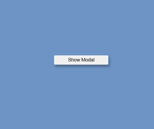
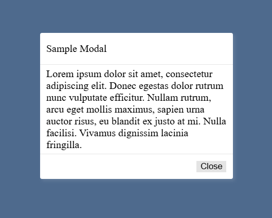
Result
Below are the sample images showing the final output of our Simple Web Application with Modal created using HTML, CSS, and JavaScript:
Web App Page
Modal Window when Shown
And there you have it! I have also provided a downloadable source code package (ZIP file) that contains the complete script used in this tutorial. You are free to download, modify, and integrate it into your own projects.
I hope this Simple Modal Tutorial using HTML, CSS, and JavaScript has helped you understand how to build a useful and reusable feature for your web applications. You can now enhance your projects with this modal window and customize it according to your needs.
Don’t forget to explore more on this website for additional Programming Tutorials, Free Source Codes, and Articles covering various web development and programming languages.