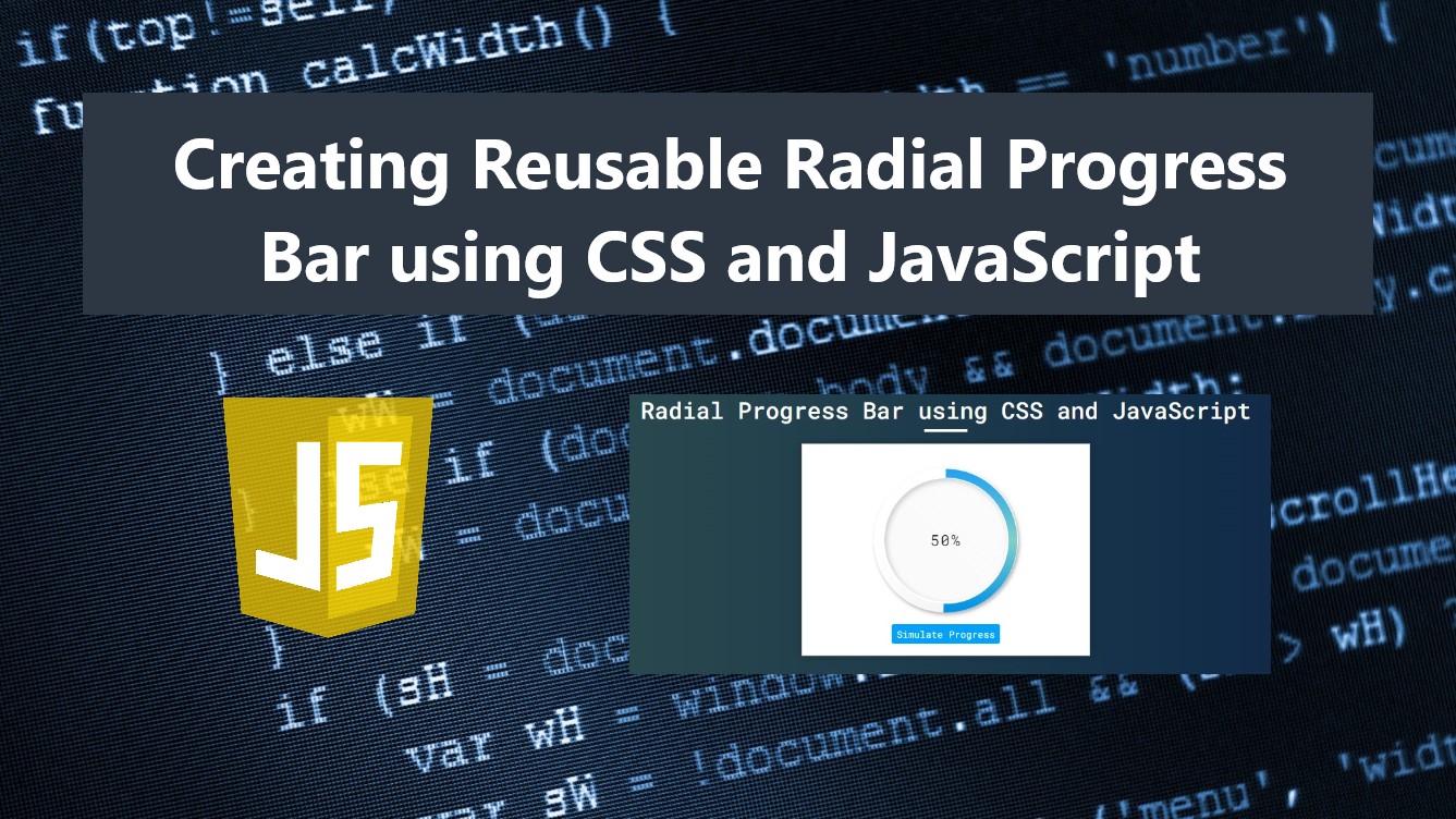
Creating a Reusable Radial Progress Bar using CSS and JS Tutorial
In this tutorial, you can learn how to create a Reusable Radial Progress Bar using CSS and Pure JavaScript. The tutorial aims to provide students and beginners with a reference for creating a useful component for a website or web application. Here, I will be providing simple web page scripts that demonstrate this, and the complete source code zip file is also provided and is free to download.
What is Radial Progress Bar?
A Radial Progress Bar is a type of progress bar that is shown or represented in a circular shape. It can be used for showing the progress of the process or executing functions in a web application or website such as file uploading or downloading functionalities.
How to Create Radial Progress Bar?
The Radial Progress Bar can be created using HTML, CSS, and JavaScript without using any other JS libraries. Using the HTML and CSS we can create the Radial Progress Bar interface on how it looks on the client side and how it looks when progress is updated. Then, using some of the JavaScript useful built-in methods, functions, event listeners, and API we can make the said progress bar functional. Check out the scripts I have created and provided below to understand them more.
Sample Web Page
The following scripts result in a simple web page that contains a Radial Progress Bar. The display of the script results in how the radial progress bar looks. The script contains also simple simulation scripts to demonstrate the functionality of the radial progress bar.
HTML
Here's the HTML file script known as index.html. This file contains the page layout and the progress bar wrapper elements.
- <!DOCTYPE html>
- <html lang="en">
- <head>
- <meta charset="UTF-8">
- <meta name="viewport" content="width=device-width, initial-scale=1.0">
- <link rel="stylesheet" href="style.css">
- <link rel="preconnect" href="https://fonts.googleapis.com">
- <link rel="preconnect" href="https://fonts.gstatic.com" crossorigin>
- <link rel="stylesheet" href="https://fonts.googleapis.com/css2?family=Material+Symbols+Outlined:opsz,wght,FILL,[email protected],100..700,0..1,-50..200" />
- </head>
- <body>
- <div class="container">
- <hr id="title_hr">
- <div id="wrapper">
- <!-- Progress Wrapper -->
- <div id="sampleProgress1" class="radial-progress-wrapper" data-progress="100">
- </div>
- <!-- Progress Wrapper -->
- </div>
- </body>
- </html>
CSS
Next, here's the CSS file script known as style.css. The file contains the stylesheet scripts of the page and radial bar design.
- @import url('https://fonts.googleapis.com/css2?family=Roboto+Mono:ital,wght@0,100;0,200;0,300;0,400;0,500;0,600;1,100;1,200;1,300;1,400;1,500;1,600&display=swap');
- *{
- margin: 0;
- padding: 0;
- box-sizing: border-box;
- font-family: 'Roboto Mono', monospace;
- }
- .material-symbols-outlined {
- font-variation-settings:
- 'FILL' 0,
- 'wght' 400,
- 'GRAD' 0,
- 'opsz' 48
- }
- ::selection{
- color: #fff;
- background: #4db2ec;
- }
- body{
- display: flex;
- align-items: center;
- justify-content: center;
- min-height: 100vh;
- background: #0B2447;
- background-image: linear-gradient(to right, #2E4F4F 0%, #0B2447 100%);
- }
- #page-title{
- color: #fff;
- text-align: center;
- font-weight: 500;
- }
- #title_hr{
- width:60px;
- border: 2px solid #ffffff;
- margin: .35em auto;
- }
- #wrapper{
- width: 400px;
- margin: 1em auto;
- padding: 1em 2em;
- display: flex;
- flex-direction: column;
- align-items: center;
- justify-content: center ;
- background-color: #fff;
- border: 1px solid #b9b9b9;
- box-shadow: 0px 0px 10px #1313134d;
- }
- @media (max-width:480px){
- #wrapper{
- width: 90% !important;
- }
- }
- /* Radial Progress Bar */
- .radial-progress-wrapper{
- --progress-percentage:590;
- width:200px;
- height:200px;
- margin: 1em auto;
- position: relative;
- }
- /* Progress Outer */
- .progress-outer{
- width: 100%;
- height: 100%;
- border-radius: 50%;
- box-shadow: 2px 3px 5px #1c1c1c57;
- display: flex;
- align-items: center;
- justify-content: center;
- }
- /* Progress Inner */
- .progress-inner {
- position: relative;
- z-index: 3;
- width: 85%;
- height: 85%;
- border-radius: 50%;
- box-shadow: inset 3px 3px 7px #1c1c1c36;
- background: linear-gradient(45deg, #bbbbbb12, #e9e9e933);
- display: flex;
- align-items: center;
- justify-content: center;
- }
- .radial-progress-wrapper svg {
- position: absolute;
- top: 0;
- left: 0;
- height: 100%;
- width: 100%;
- }
- .radial-progress-wrapper circle:nth-child(2) {
- fill: none;
- stroke: url(#glowGradient);
- stroke-width: 12px;
- stroke-dasharray: 590;
- stroke-dashoffset: 0;
- transform-origin: center;
- transform: rotate(0deg);
- cx: 99;
- cy: 100;
- r: 93;
- animation: radialProgressLoad 1s ease-in-out infinite;
- }
- @keyframes radialProgressLoad {
- 0%{
- transform: rotate(0deg);
- }
- 100%{
- transform: rotate(360deg);
- }
- }
- .radial-progress-wrapper circle:nth-child(3) {
- fill: none;
- /* stroke: #0093E9; */
- stroke: url(#borderGradientColor);
- stroke-width: 12px;
- stroke-dasharray: 590;
- stroke-dashoffset: var(--progress-percentage);
- transform-origin: center;
- transform: rotate(-90deg);
- cx: 99;
- cy: 100;
- r: 93;
- transition: all .2s ease-in-out;
- }
- @keyframes radialProgress {
- 0%{
- stroke-dashoffset: 590;
- }
- 100%{
- stroke-dashoffset: 0;
- }
- }
- span.radial-progress-text {
- font-size: 1.3rem;
- font-weight: 400;
- color: #2e2e2e;
- letter-spacing: 2px;
- }
- /* Simulate Button */
- button#simulateBtn {
- background: #00a1ff;
- color: #fff;
- padding: 0.35em 0.5em;
- border: none;
- outline: none;
- cursor: pointer;
- border-radius: 3px;
- }
JavaScript
Lastly, here's the JavaScript file script known as script.js. It contains the codes for initializing the radial progress bar. It also contains the codes for simulating the functionality of the progress bar.
- // Select All Radial Progress Element
- const radialProgAll = document.querySelectorAll('.radial-progress-wrapper')
- // Radial Element Content
- const progElHTML = `<div class="progress-outer">
- <div class="progress-inner">
- <span class="radial-progress-text">0%</span>
- </div>
- </div>
- <svg>
- <defs>
- <linearGradient class="borderGradientColor" id="borderGradientColor" x1="0%" y1="0%" x2="100%" y2="0%">
- <stop offset="0%" style="stop-color:#0093E9;stop-opacity:1"></stop>
- <stop offset="50%" style="stop-color: #80D0C7;stop-opacity:1"></stop>
- <stop offset="100%" style="stop-color:#23a4ef;stop-opacity:1"></stop>
- </linearGradient>
- <linearGradient class="glowGradient" id="glowGradient" x1="0%" y1="0%" x2="100%" y2="0%">
- <stop offset="0%" style="stop-color:#1414141e;stop-opacity:.5"></stop>
- <stop offset="100%" style="stop-color:#e7e7e700;stop-opacity:.5"></stop>
- </linearGradient>
- </defs>
- <circle />
- <circle />
- </svg>`
- // Update Radial Progress Bar and Text
- const UpdateRadialProgress = (el)=>{
- // Get SVG Cirle's stoke dashes
- var dashArray = parseFloat(window.getComputedStyle(el.querySelectorAll('circle')[1]).getPropertyValue('stroke-dasharray').replace('px', ''))
- // Calculate percentage
- var perc = (el.dataset.progress || 0) / 100
- // Compute Progress
- var progress = dashArray - (dashArray * perc)
- // Set New Progress
- el.style.setProperty('--progress-percentage', progress)
- // Change Progress Text
- el.querySelector('.radial-progress-text').innerText = (Math.floor(perc * 100)) + '%'
- }
- // Observer for attribute changes
- var observer = new MutationObserver(function(mutations, observer) {
- mutations.forEach(function(mutation) {
- if (mutation.type === "attributes") {
- // disconnecte observer first
- observer.disconnect()
- // Update Progress
- UpdateRadialProgress(mutation.target)
- // Reconnect Observer
- observer.observe(mutation.target, {attributes: true})
- }
- });
- });
- // Initialize Radial Progress Bar
- radialProgAll.forEach((el, idx) => {
- // Insert Radial Progress Element
- el.innerHTML = progElHTML
- // Renaming child Element IDs
- el.querySelector('#borderGradientColor').id = el.querySelector('#borderGradientColor').id + idx
- el.querySelector('#glowGradient').id = el.querySelector('#glowGradient').id + idx
- // Update Circle Stoke URL
- el.querySelectorAll('circle')[1].style.stroke = `url(#borderGradientColor${idx})`
- el.querySelectorAll('circle')[0].style.stroke = `url(#glowGradient${idx})`
- // Run Observer
- observer.observe(el, {
- attributes: true
- });
- //Update Radial Progress
- UpdateRadialProgress(el)
- })
- /**
- * Simulation Script
- */
- // Sample Progress Bar Element
- const sampleProgress = document.getElementById('sampleProgress1')
- // Simulator Button
- const simulateButton = document.getElementById('simulateBtn')
- // Simulator Function
- const simulateProgress = () =>{
- var i = 0;
- // Set Progress to 0
- sampleProgress.dataset.progress = 0
- simulateButton.style.display = `none`
- // Simulation Proccess
- var simulateInterval= setInterval(()=>{
- if(i < 100){
- sampleProgress.dataset.progress = i
- }else{
- sampleProgress.dataset.progress = 100
- clearInterval(simulateInterval)
- simulateButton.removeAttribute('style')
- return false
- }
- i = i + Math.floor(Math.random() * 5)
- },800)
- }
- simulateButton.addEventListener('click', e=>{
- e.preventDefault()
- simulateProgress()
- })
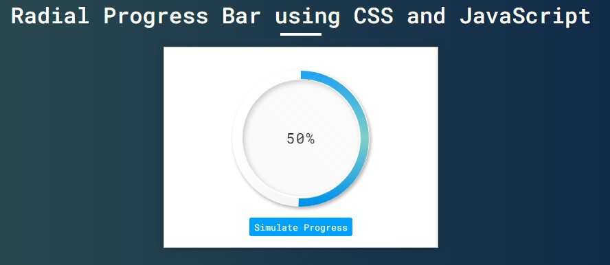
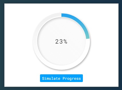
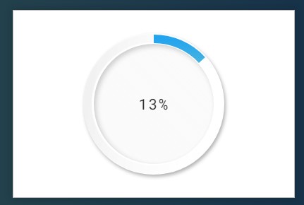
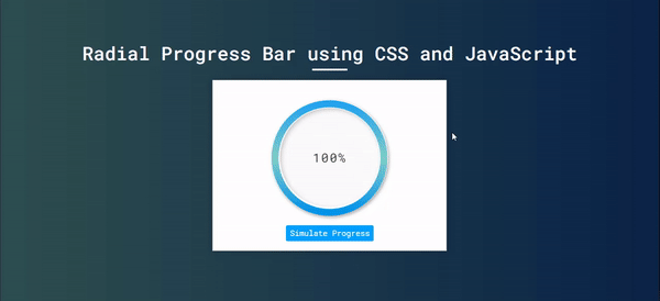
Snapshots
Here are some snapshots of the overall result of the provided scripts.
Page Interface
Radial Progress Bar
Progress Bar Simulating
DEMO
There you go! I have also provided the complete source code zip file of the scripts I have given above on this site and it is free to download. Feel Free to download and modify the source code the way you desire to do more experiments and enhance your programming capabilities.
How to Run?
- Download the provided source code zip file. (download button is located below)
- Extract the downloaded source code zip file.
- Locate the index.html file in the extracted source code directory.
- Browse the index file with your preferred browser.
That's it! I hope this Creating a Reusable Radial Progress Bar using CSS and JS Tutorial will help you with what you are looking for and will be useful for your current and future web application projects.
Explore more on this website for more Tutorials and Free Source Codes.