Creating a Responsive Our Team Template using HTML and CSS Tutorial
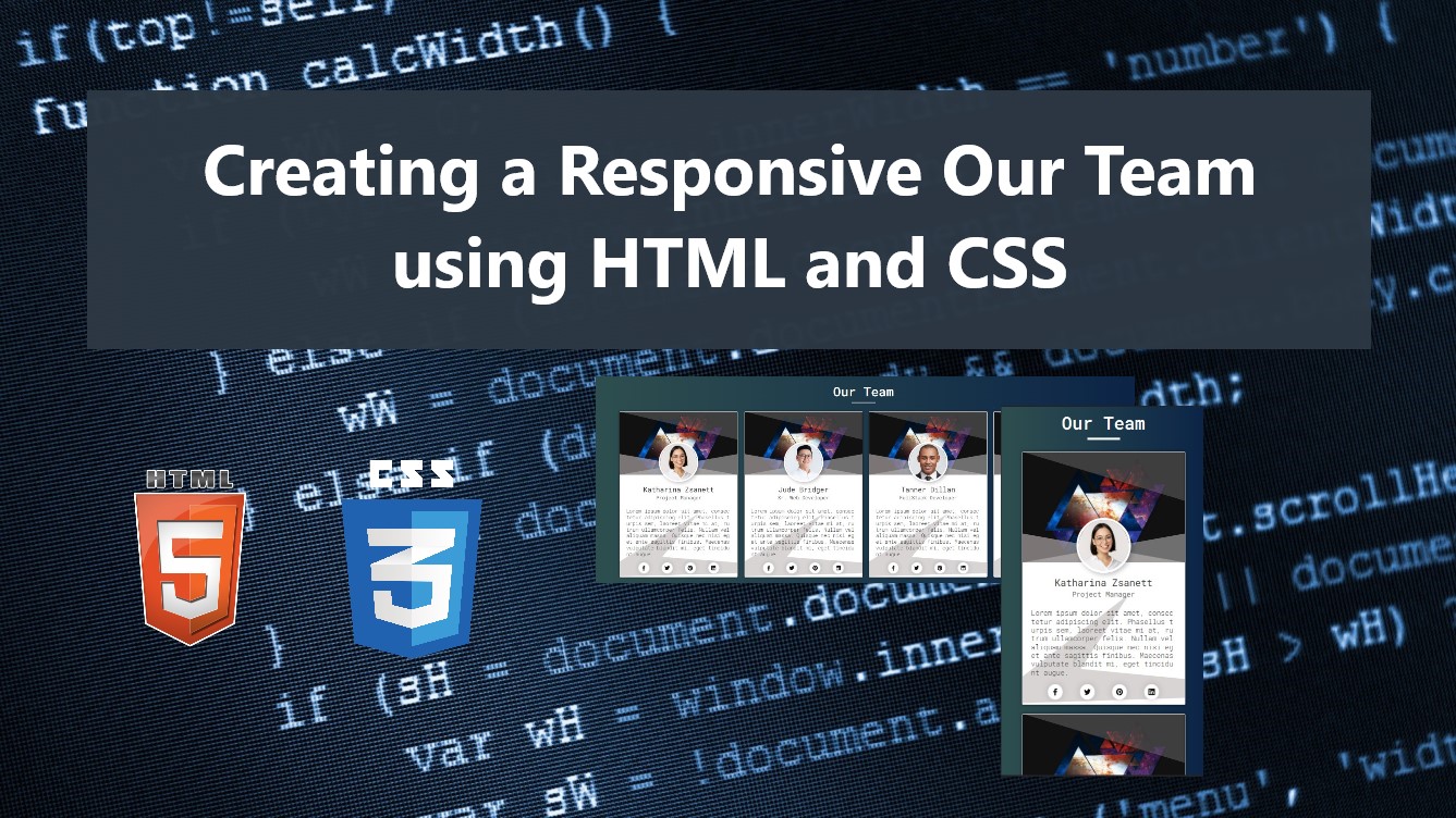
In this tutorial, you can learn to create Responsive Our Team or Team Profile Cards for websites using HTML and CSS. The tutorial aims to provide students and beginners with a reference for learning to create and design an interactive template for websites. Here, I will be also providing simple web page scripts that demonstrate the creation of a simple Responsive Our Team Section Template.
What is Our Team Profile Cards?
The Our Team or Team Profile Cards is one of the common sections or often implemented website sections or components. This section is containing a list of the company, organization, or any other team members which usually comes with the individual image, name, position, details, and social links.
How to Create a Responsive Our Team or Team Profile Cards?
Creating a Responsive Our Team or Team Profile Cards user interface or template can be achieved using only HTML and CSS. We can simply list all the list of the team profile details using some HTML elements such as DIV elements and some other elements for designing it. The CSS is a stylesheet script that will handle the design of the elements and make it responsive to any device screen such as Desktops, Laptops, smartphones, or tablets. Using the CSS @media rule, we can set the new design script that the device will use for a certain maximum or minimum of the screen. Check out the simple web page scripts that I created below to have a better idea of how to achieve it in an actual web page.
Sample Web Page Scripts
The following scripts result in a simple website page that contains the list of Company Team Profiles. The page displays the team or member items in grid view which has 4 columns for bigger device screens and reduces depending on the device screen. Each team member's details are shown in a simple Card UI with a simple interactive design.
HTML
Here is the HTML file script known as index.html. The file contains the HTML elements of the page layout including the card wrapper and items of each team member.
- <!DOCTYPE html>
- <html lang="en">
- <head>
- <meta charset="UTF-8">
- <meta name="viewport" content="width=device-width, initial-scale=1.0">
- <link rel="stylesheet" href="style.css">
- <link rel="preconnect" href="https://fonts.googleapis.com">
- <link rel="preconnect" href="https://fonts.gstatic.com" crossorigin>
- <link rel="stylesheet" href="https://cdnjs.cloudflare.com/ajax/libs/font-awesome/6.4.0/css/all.min.css" integrity="sha512-iecdLmaskl7CVkqkXNQ/ZH/XLlvWZOJyj7Yy7tcenmpD1ypASozpmT/E0iPtmFIB46ZmdtAc9eNBvH0H/ZpiBw==" crossorigin="anonymous" referrerpolicy="no-referrer" />
- </head>
- <body>
- <div class="container">
- <hr id="title_hr">
- <div id="wrapper">
- <!-- Card Profile Item -->
- <div class="card-profile-item">
- <div class="card-profile">
- <div class="card-profile-header">
- </div>
- <div class="card-profile-subheader">
- <div class="card-profile-details">
- <div class="profile-img">
- <img src="./image-1.jpg" alt="Image by wayhomestudio on Freepik">
- </div>
- </div>
- </div>
- <div class="card-profile-body">
- <div class="profile-social-links">
- </div>
- </div>
- </div>
- </div>
- <!-- Card Profile Item -->
- <!-- Card Profile Item -->
- <div class="card-profile-item">
- <div class="card-profile">
- <div class="card-profile-header">
- </div>
- <div class="card-profile-subheader">
- <div class="card-profile-details">
- <div class="profile-img">
- <img src="./image-2.jpg" alt="Image by wayhomestudio on Freepik">
- </div>
- </div>
- </div>
- <div class="card-profile-body">
- <div class="profile-social-links">
- </div>
- </div>
- </div>
- </div>
- <!-- Card Profile Item -->
- <!-- Card Profile Item -->
- <div class="card-profile-item">
- <div class="card-profile">
- <div class="card-profile-header">
- </div>
- <div class="card-profile-subheader">
- <div class="card-profile-details">
- <div class="profile-img">
- <img src="./image-3.jpg" alt="Image by wayhomestudio on Freepik">
- </div>
- </div>
- </div>
- <div class="card-profile-body">
- <div class="profile-social-links">
- </div>
- </div>
- </div>
- </div>
- <!-- Card Profile Item -->
- <!-- Card Profile Item -->
- <div class="card-profile-item">
- <div class="card-profile">
- <div class="card-profile-header">
- </div>
- <div class="card-profile-subheader">
- <div class="card-profile-details">
- <div class="profile-img">
- <img src="./image-4.jpg" alt="Image by wayhomestudio on Freepik">
- </div>
- </div>
- </div>
- <div class="card-profile-body">
- <div class="profile-social-links">
- </div>
- </div>
- </div>
- </div>
- <!-- Card Profile Item -->
- </div>
- </body>
- </html>
CSS
The following CSS scripts are written in a file script known as style.css. This file is imported or loaded at the index.html file.
Creating the Page Layout Design
The following stylesheet codes are used for designing the page layout, page title, backgrounds, and more.
- @import url('https://fonts.googleapis.com/css2?family=Dongle:wght@300;400;700&family=Roboto+Mono:ital,wght@0,100;0,200;0,300;0,400;0,500;0,600;1,100;1,200;1,300;1,400;1,500;1,600&display=swap" rel="stylesheet');
- *{
- margin: 0;
- padding: 0;
- box-sizing: border-box;
- font-family: 'Dongle', sans-serif;
- font-family: 'Roboto Mono', monospace;
- }
- ::selection{
- color: #fff;
- background: #4db2ec;
- }
- body{
- display: flex;
- align-items: center;
- justify-content: center;
- min-height: 100vh;
- background: #0B2447;
- background-image: linear-gradient(to right, #2E4F4F 0%, #0B2447 100%);
- padding: 2em 0;
- }
- #page-title{
- color: #fff;
- text-align: center;
- font-weight: 500;
- }
- #title_hr{
- width:60px;
- border: 2px solid #ffffff;
- margin: .35em auto;
- }
Creating the Card Wrapper Design
The codes below are used for designing the card items' wrapper or container. It also contains the scripts that make the card items responsive on any device screen.
- /* Card Wrapper */
- #wrapper{
- width: 1300px;
- margin: 1em auto;
- padding: 1em 2em;
- display: grid;
- grid-template-columns: repeat(4, 1fr);
- grid-gap: 1em;
- margin: 0.35em auto;
- }
- @media (max-width:1350px){
- #wrapper{
- width: 100%;
- grid-template-columns: repeat(3, 1fr);
- }
- }
- @media (max-width:950px){
- #wrapper{
- width: 100%;
- grid-template-columns: repeat(2, 1fr);
- }
- }
- @media (max-width:750px){
- #wrapper{
- width: 100%;
- grid-template-columns: repeat(1, 1fr);
- }
- }
Designing the Card Item Containers
The scripts below are the stylesheet codes for the design of the card items container.
- /* Card Profile Item */
- .card-profile-item {
- margin: auto;
- }
- /* Card Profile */
- .card-profile {
- position: relative;
- width: 300px;
- background: #fff;
- border: 1px solid #c1c1c1;
- border-radius: 2px;
- box-shadow: 0px 0px 5px #0c0c0cab;
- }
- .card-profile:before {
- content: "";
- position: absolute;
- top: 0;
- left: 0;
- z-index: 1;
- width: 100%;
- height: 30vh;
- background: #dfdddd38;
- clip-path: polygon(0% 0%, 1% 0%, 100% 44%, 100% 0%);
- }
- .card-profile:after {
- content: "";
- position: absolute;
- bottom: 0;
- left: 0;
- z-index: 3;
- width: 100%;
- height: 30vh;
- background: #4c3d3d38;
- clip-path: polygon(66% 0%, 36% 68%, 191% 90%, -22% 100%);
- }
Designing the Card Item Header
The script below is the stylesheet codes for designing the card item header image and some triangle designs.
- /* Card header */
- .card-profile-header {
- position: relative;
- width: 100%;
- height: 30vh;
- margin-bottom: 60px;
- background-image: url(./default-bg.jpg);
- background-size: cover;
- background-repeat: no-repeat;
- background-position: center center;
- overflow-x: hidden;
- }
- .card-profile-header:before {
- content: "";
- position: absolute;
- width: 100%;
- height: 40%;
- bottom: 0;
- border-bottom: 58px solid #c9bebe94;
- border-right: 330px solid transparent;
- left: -330px;
- }
- .card-profile-header:after {
- content: "";
- position: absolute;
- z-index:1 ;
- width: 100%;
- height: 40%;
- bottom: 0;
- border-bottom: 58px solid #bfbfbf8a;
- border-left: 330px solid transparent;
- right: -330px;
- }
Designing the Card Item Sub-Header
The script below is for the design of the member image, name, and position.
- /* Position Subheader */
- .card-profile-subheader {
- position: relative;
- z-index: 2;
- width: 100%;
- top: -147px;
- left: 0;
- padding-bottom: 1em;
- }
- /* Position Details */
- .card-profile-details {
- position: absolute;
- width: 100%;
- left: 0;
- }
- /* profile image */
- .profile-img {
- width: 100px;
- height: 100px;
- margin: 0.35em auto;
- border: 4px solid #fff;
- box-shadow: 3px 3px 10px #00000042;
- border-radius: 50% 50%;
- overflow: hidden;
- }
- .profile-img > img{
- height: 100%;
- width: 100%;
- object-fit: cover;
- object-position: top center;
- }
- /* Profile Name */
- .profile-name {
- padding: 0.05em 2.5em;
- text-align: center;
- font-size: 1.1rem;
- color: #323232;
- }
- .profile-sub {
- padding: 0 3em;
- text-align: center;
- font-size: .8rem;
- color: #5c5c5c;
- }
Designing the Card Item Body
Lastly, here are the scripts used for designing the card body contents or the other details of the members such as the social links.
- /* Card Body */
- .card-profile-body {
- position: relative;
- padding: 0.5em 1em;
- }
- /* Card Description */
- .profile-description {
- color: #020202;
- line-height: 1.2em;
- font-size: .8rem;
- font-weight: 300;
- text-align: unset;
- word-break: break-all;
- padding-bottom: 1em;
- }
- /* Social Links */
- .profile-social-links {
- position: relative;
- z-index: 4;
- display: flex;
- flex-wrap: wrap;
- justify-content: space-evenly;
- }
- a.profile-social-link {
- display: flex;
- width: 1.8rem;
- height: 1.8rem;
- background: #fff;
- text-decoration: none;
- border-radius: 50% 50%;
- color: #0e0e0e;
- font-size: 0.8rem;
- align-items: center;
- justify-content: center;
- border: 1px solid #e5e5e5;
- box-shadow: 0px 0px 13px #00000029;
- transition: all .2s ease;
- }
- a.profile-social-link:hover {
- transform: scale(1.04) translateY(-1px);
- }
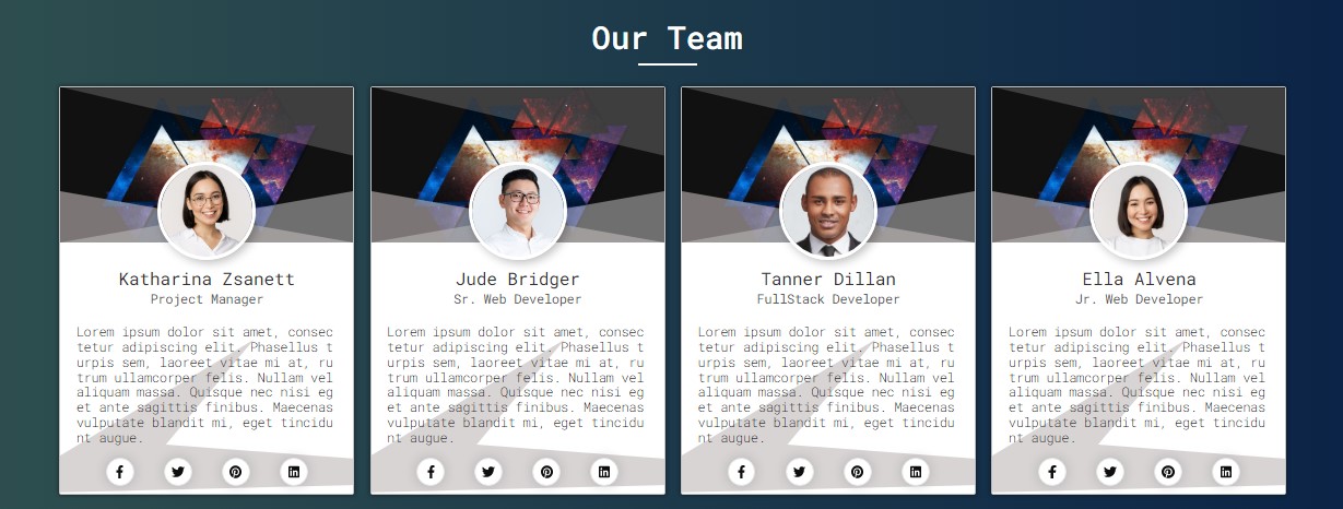
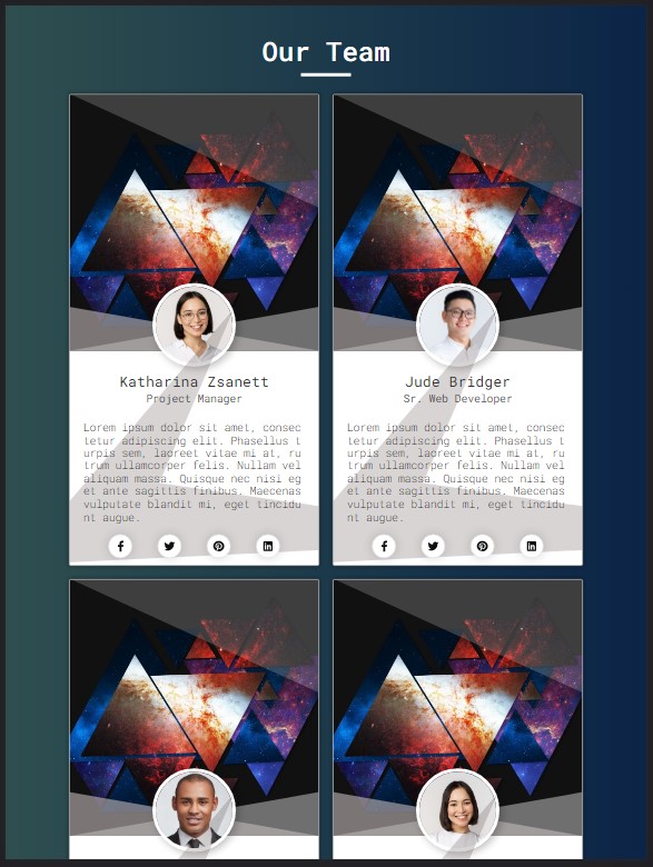
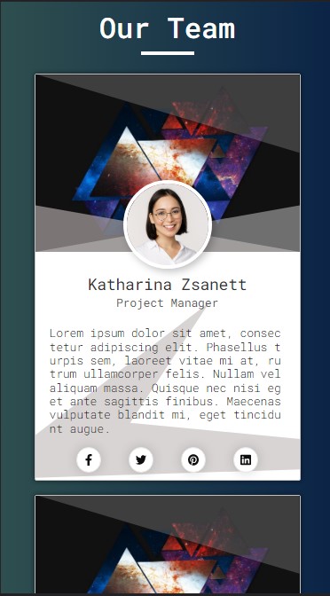
Snapshots
Here are some snapshots of the overall result of the script I have provided above.
Desktop View
Tablet View
Mobile/Smartphone View
DEMO Video
There you go! I have provided also the complete source code zip file including the images I have used for the sample web page on this website and it is free to download. Feel free to download and modify the source code to do some experiments to enhance your HTML and CSS knowledge and capabilities.
That's it! I hope this Creating a Responsive Our Team Template using HTML and CSS Tutorial will help you with what you are looking for and will be useful for your current and future web application or website projects.
Explore more on this website for more Tutorials and Free Source Codes.