Creating a 3D Card Flip Animation using HTML and CSS Tutorial
In this tutorial, you can learn to create a simple 3D Card Flip Animation using HTML and CSS. The tutorial aims to provide students and beginners with a reference for learning some CSS tricks to develop a creative user interface and functionality of a website or web application. Here, I will be providing simple web page scripts that demonstrate the creation of a card container or elements with a 3D flip animation.
What is Flip Animation?
Flip Animation is an animation that contains an element with a front and back face. This animation flip or rotates the element from front to back face or vice-versa. It works like turning the piece of paper or plane sheet to view the other side or the backside. This animation is useful to a website for designing card elements with contents in both the front and back faces.
How to create a 3D Flip Animation using CSS?
The 3D Flip Animation can be easily achieved using CSS or Cascading Stylesheet. CSS comes with multiple useful properties for creating HTML Elements more creative and interactive. Using the CSS transform, transform-style, and perspective properties, we can create a 3D Flip Animation. The transform property will be used for flipping or rotating the HTML element using either rotateX() or rotateY() values. For the transform-style, we can set the element and its container to preserve-3d which indicates that child elements should be positioned in the 3D space. The perspective property will be used to determine the distance between the element plane and the user. Check out the sample web page scripts that I provided below to have a better idea of how to create a 3D Flip Animation.
Sample Web Application
Here are the scripts of a simple web application page that demonstrate the creation of a simple 3D Flip Animation. The web page contains a single card with 2 faces (front and back) and has different content. The card will flip when the user will hover the card to display the design and content of the back face.
HTML
Here is the HTML file script of the web page which contains the HTML elements of the card. It also contains the elements used for the web page layout. Save the file as index.html.
- <!DOCTYPE html>
- <html lang="en">
- <head>
- <meta charset="UTF-8">
- <meta http-equiv="X-UA-Compatible" content="IE=edge">
- <meta name="viewport" content="width=device-width, initial-scale=1.0">
- <link rel="preconnect" href="https://fonts.googleapis.com">
- <link rel="preconnect" href="https://fonts.gstatic.com" crossorigin>
- <link rel="stylesheet" href="https://fonts.googleapis.com/css2?family=Material+Symbols+Outlined:opsz,wght,FILL,[email protected],100..700,0..1,-50..200" />
- <link rel="stylesheet" href="style.css">
- </head>
- <body>
- <div id="wrapper">
- <hr style="margin:auto; width:25px">
- <div id="card-wrapper">
- <div class="card">
- <div class="card-front">
- </div>
- <div class="card-back">
- <hr width="15px">
- </div>
- </div>
- </div>
- </div>
- </body>
- </html>
Stylesheet
Here's the CSS file script that contains the page elements' styles. The script is used for designing the layout of the web page and contents. It also contains the script for adding a 3D Flip Animation to the card element when the user hovers over the element. Save this file as style.css and make sure to load the file in the index file.
- @import url('https://fonts.googleapis.com/css2?family=Rubik&display=swap');
- @import url('https://fonts.googleapis.com/css2?family=Courgette&family=Secular+One&display=swap" rel="stylesheet');
- @import url('https://fonts.googleapis.com/css2?family=Satisfy&display=swap" rel="stylesheet');
- :root{
- --secular-font: 'Secular One', sans-serif;
- --satisfy-font: 'Satisfy', cursive;
- }
- *{
- box-sizing: border-box;
- }
- body *{
- font-family: 'Rubik', sans-serif;
- }
- /**
- Page Design
- */
- body,
- html{
- height: 100%;
- width: 100%;
- margin: 0;
- padding: 0;
- }
- body{
- background-color: #363636;
- }
- /* Page Wrapper */
- #wrapper{
- width: 100%;
- padding: 3em 5em;
- }
- .page-title{
- font-size: 2.5rem;
- font-weight: 500;
- color: #fff;
- letter-spacing: 3px;
- font-family: var(--secular-font);
- text-align: center;
- }
- /* Card Wrapper and containers */
- #card-wrapper{
- width: 100%;
- padding: 2em 0;
- }
- .card{
- position: relative;
- width: 250px;
- height: 300px;
- margin:auto;
- display: flex;
- transform-style: preserve-3d;
- perspective: 500px;
- }
- .card .card-front,
- .card .card-back{
- position: absolute;
- width: 100%;
- height: 100%;
- background:#fff;
- display:flex;
- flex-direction: column;
- align-items: center;
- justify-content: center;
- backface-visibility: hidden;
- transform-style: preserve-3d;
- transition: all 1s ease;
- border: 1px solid #a5a5a5;
- box-shadow: 2px 2px 6px #f1f1f140;
- }
- .card .card-front:before,
- .card .card-back:before{
- content: "";
- position:absolute;
- height: 2px;
- bottom: -27px;
- background: linear-gradient(95deg, transparent, #222121, transparent);
- box-shadow: 1px 1px 5px #1e1e1e;
- transition: all 1s ease-in-out;
- }
- .card .card-front:before{
- width: 100%;
- }
- .card .card-back:before{
- width: 0%;
- }
- .card .card-front{
- /* background-image: linear-gradient(to top, #5ee7df 0%, #b490ca 100%); */
- background-image: url(./bg.jpg);
- background-repeat: no-repeat;
- background-size: cover;
- transform: rotateY(0deg);
- }
- .card .card-front .card-title{
- font-size: 1rem;
- letter-spacing: 4px;
- font-weight: 600;
- font-family: var(--secular-font);
- color: #fff;
- text-shadow: 1px 1px 3px #000;
- text-align: center;
- }
- .card .card-back{
- transform: rotateY(180deg);
- padding: 1em;
- }
- .card .card-back .card-title{
- font-size: 1.2rem;
- font-family: var(--satisfy-font);
- text-align: center;
- }
- .card .card-back .card-description {
- font-size: .9rem;
- font-family: var(--satisfy-font);
- text-align: center;
- color: #3c3c3c;
- letter-spacing: 1.5px;
- }
- /*
- Flip Animation when Card is Hover
- */
- .card:hover .card-front{
- transform: rotateY(-180deg)
- }
- .card:hover .card-front:before{
- width: 0%;
- }
- .card:hover .card-back{
- transform: rotateY(0deg)
- }
- .card:hover .card-back:before{
- width: 100%;
- }
Kindly replace the image path used as the background of the front face of the card.
Snapshots
Here are the snapshots of the sample web page using the given HTML and CSS scripts above.
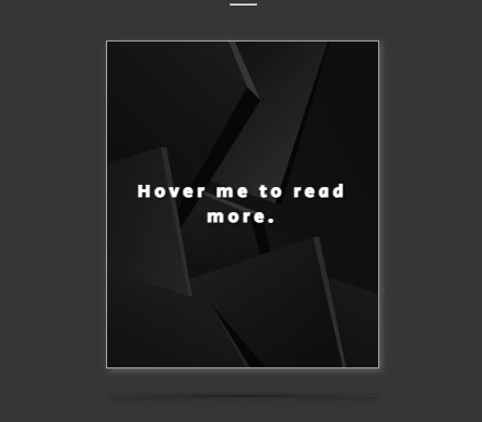
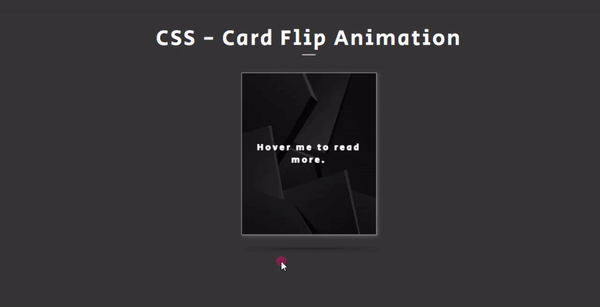
Card Front Face
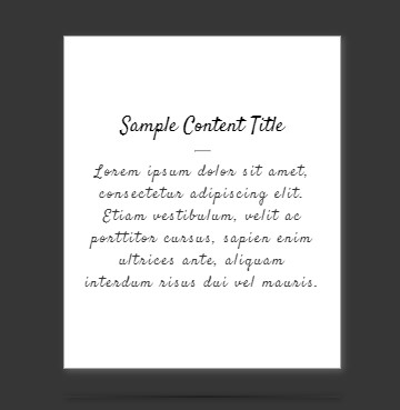
Card Back Face
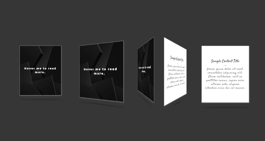
The Card when Flipping
DEMO
The following is the overall result of the scripts I provided:
There you go! I have also provided the complete source code zip file that I created for the demonstration of this tutorial on this site. The zip file is free to download. Feel free to download and do some experiments to enhance your skills or design capabilities. The download button is located below this tutorial's content.
That's the end of this tutorial! I hope this Creating a 3D Card Flip Animation using HTML and CSS Tutorial will help you with what you are looking for and will be useful for your current and future web application projects.
Explore more on this website for more Tutorials and Free Source Codes.