Creating an Expanding Flex Cards using HTML, CSS, and JS Tutorial

In this tutorial, I will show how to create Expanding Flex Cards for websites using HTML, CSS, and JavaScript. The tutorial aims to provide the students and new programmers with a reference for learning to build a creative collapsible content container using HTML, CSS, and JS. Here, I will be providing a simple web application or page script that demonstrates Expanding Flex Cards.
How do the Expanding Flex Cards work?
The Expanding Flex Cards work something like the accordion component or the collapsible content container. The difference of this component is that the content headers are being vertically displayed or shown inline and the content is collapsing leftward/rightward.
How to Create Expanding Flex Cards?
The Expanding Flex Cards can be easily achieved using HTML elements, CSS properties and pseudo-elements, and a little JavaScript. We can simply create the list of cards and card items using the HTML elements such as the DIV element <div></div>. Then we can create/customize the flex cards the way wanted and add a short JavaScript line of codes to make the collapsing effect or feature functional.
Example
Here's an example web page script that I created to demonstrate the creation of the Expanding Flex Cards and how it works.
HTML
Here's the HTML script of the web page layout and flex card elements. Make sure to change the path of the loaded images with the image paths that are available on your end.
index.html
- <!DOCTYPE html>
- <html lang="en">
- <head>
- <meta charset="UTF-8">
- <meta http-equiv="X-UA-Compatible" content="IE=edge">
- <meta name="viewport" content="width=device-width, initial-scale=1.0">
- <link rel="preconnect" href="https://fonts.googleapis.com">
- <link rel="preconnect" href="https://fonts.gstatic.com" crossorigin>
- <link href="https://fonts.googleapis.com/css2?family=Mynerve&display=swap" rel="stylesheet">
- <link rel="stylesheet" href="style.css">
- </head>
- <body>
- <section>
- <hr width="50px">
- <!-- Flex Cards Container -->
- <div class="expanding-flex-cards">
- <div class="expanding-flex-cards-item active">
- <img src="images/image1.jpg" alt="" class="expanding-flex-cards-item-img">
- <div class="expanding-flex-cards-item-body">
- </div>
- <div class="expanding-flex-cards-item-footer">
- </div>
- </div>
- <div class="expanding-flex-cards-item">
- <img src="images/image2.jpg" alt="" class="expanding-flex-cards-item-img">
- <div class="expanding-flex-cards-item-body">
- </div>
- <div class="expanding-flex-cards-item-footer">
- </div>
- </div>
- <div class="expanding-flex-cards-item">
- <img src="images/image3.png" alt="" class="expanding-flex-cards-item-img">
- <div class="expanding-flex-cards-item-body">
- </div>
- <div class="expanding-flex-cards-item-footer">
- </div>
- </div>
- <div class="expanding-flex-cards-item">
- <img src="images/image4.png" alt="" class="expanding-flex-cards-item-img">
- <div class="expanding-flex-cards-item-body">
- </div>
- <div class="expanding-flex-cards-item-footer">
- </div>
- </div>
- <div class="expanding-flex-cards-item">
- <img src="images/image5.png" alt="" class="expanding-flex-cards-item-img">
- <div class="expanding-flex-cards-item-body">
- </div>
- <div class="expanding-flex-cards-item-footer">
- </div>
- </div>
- </div>
- <!-- End of Flex Cards Container -->
- </section>
- </body>
- </html>
CSS
Here's the stylesheet or the CSS script of the web page layout and flex cards container and items. The card items will be listed horizontally as the result of the following script. It also hides some elements or contents of the items for those inactive card items.
style.css
- :root{
- --mynerve-font:'Mynerve', cursive;
- --light-color:#f9f9f9;
- --dark-color:#20262E;
- }
- body,
- html{
- height: 100%;
- width: 100%;
- }
- h1{
- font-family: var(--mynerve-font)
- }
- .text-center{
- text-align: center;
- }
- html{
- overflow: hidden;
- }
- body{
- background-color: var(--dark-color);
- color:var(--light-color);
- overflow:auto;
- margin: 0;
- padding: 0;
- }
- img{
- width: 600px;
- }
- /*
- * Styles
- */
- .expanding-flex-cards{
- display: flex;
- flex-wrap: nowrap;
- overflow: auto;
- justify-content:center;
- }
- .expanding-flex-cards>.expanding-flex-cards-item{
- height: 50vh;
- width: 23px;
- position: relative;
- background: transparent;
- border-radius:20px;
- overflow: hidden;
- margin-right: 15px;
- margin-top: 50px;
- margin-bottom: 50px;
- padding: 20px 10px;
- box-shadow: 0px 2px 11px #ffffff52;
- transition: all .3s ease;
- }
- .expanding-flex-cards>.expanding-flex-cards-item.active {
- width: 500px;
- }
- .expanding-flex-cards>.expanding-flex-cards-item:not(.active) {
- cursor: pointer;
- }
- .expanding-flex-cards>.expanding-flex-cards-item:hover:not(.active){
- transform: scale(1.05);
- }
- .expanding-flex-cards>.expanding-flex-cards-item>img{
- position: absolute;
- top: 0;
- left: 0;
- height: 100%;
- width: 100%;
- object-fit: cover;
- object-position: center center;
- }
- .expanding-flex-cards>.expanding-flex-cards-item>.expanding-flex-cards-item-footer {
- bottom: 20px;
- z-index: 1;
- position: absolute;
- width: 100%;
- display: flex;
- align-items: center;
- transition: all .3s ease;
- }
- .expanding-flex-cards>.expanding-flex-cards-item:not(.active)>.expanding-flex-cards-item-footer {
- bottom: 12px;
- left: calc(50% - 15px);
- max-height: calc(25%);
- overflow: hidden;
- }
- .expanding-flex-cards>.expanding-flex-cards-item>.expanding-flex-cards-item-footer>.expanding-flex-cards-icon {
- width: 30px;
- height: 30px;
- display: flex;
- align-items: center;
- justify-content: center;
- background: #fff;
- color: #464444;
- border-radius: 50% 50%;
- font-size: 16px;
- font-weight: bolder;
- box-shadow: 0px 1px 5px #00000021;
- transition: all .3s ease;
- }
- .expanding-flex-cards>.expanding-flex-cards-item>.expanding-flex-cards-item-footer>.expanding-flex-cards-title {
- padding: 0px 10px;
- text-shadow: 0px 1px 3px #1616168f;
- display: none;
- transition: all .3s ease;
- }
- .expanding-flex-cards>.expanding-flex-cards-item.active>.expanding-flex-cards-item-footer>.expanding-flex-cards-title {
- display: block;
- padding: 0px 10px;
- text-shadow: 0px 1px 3px #1616168f;
- }
- .expanding-flex-cards>.expanding-flex-cards-item>.expanding-flex-cards-item-body {
- display: none;
- position: absolute;
- left: 0;
- top: 0;
- width: calc(100% - 34px);
- height: calc(75% - 20px);
- padding: 20px 17px;
- overflow: auto;
- align-items: center;
- justify-content: center;
- }
- .expanding-flex-cards>.expanding-flex-cards-item>.expanding-flex-cards-item-body p {
- text-align: center;
- font-size: 24px;
- width: 100%;
- font-weight: 500;
- font-family: 'Mynerve';
- font-style: italic;
- text-shadow: 0.5px 0.5px 3px #000;
- }
- .expanding-flex-cards>.expanding-flex-cards-item.active>.expanding-flex-cards-item-body{
- display: flex;
- transform: scale(0);
- animation:expanding-flex-cards-item-body-reveal .8s ease forwards ;
- }
- @keyframes expanding-flex-cards-item-body-reveal{
- 0%{
- transform: scale(0);
- opacity: 0;
- }
- 100%{
- transform: scale(1);
- opacity: 1;
- }
- }
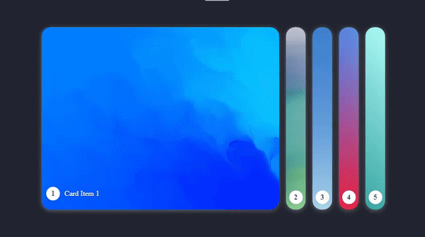
The web page will now look like the following image using the provided CSS script.
JavaScript
Here's a simple Pure JavaScript code that makes the Expanding or collapsing animation, transitions of item from inactive to an active state, and sets the previous active card item to inactive.
script.js
- const ExpandingFlexCard = document.querySelectorAll('.expanding-flex-cards')
- ExpandingFlexCard.forEach(efcEl =>{
- efcEl.querySelectorAll('.expanding-flex-cards-item:not(active)').forEach(item => {
- item.addEventListener('click', function(e){
- e.preventDefault()
- efcEl.querySelector('.expanding-flex-cards-item.active').classList.remove('active')
- this.classList.add('active')
- })
- })
- })
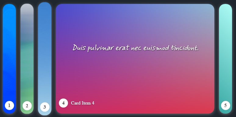
There you go! The Expanding Flex Cards will be functional using the provided JS script. As the overall result of the web page script I have provided, it will look and work like the following.
I have also provided the complete web page scripts zip file on this site and it is free to download. Feel free to download it so you can do some experiments for enhancing it and enhancing your programming capabilities for website UI/UX. The download button is located below this tutorial's content.
That's it! I hope this Creating an Expanding Flex Cards using HTML, CSS, and JS Tutorial will help you with what you are looking for and will be useful for your current and future web application projects.
Explore more on this website for more Tutorials and Free Source Codes.