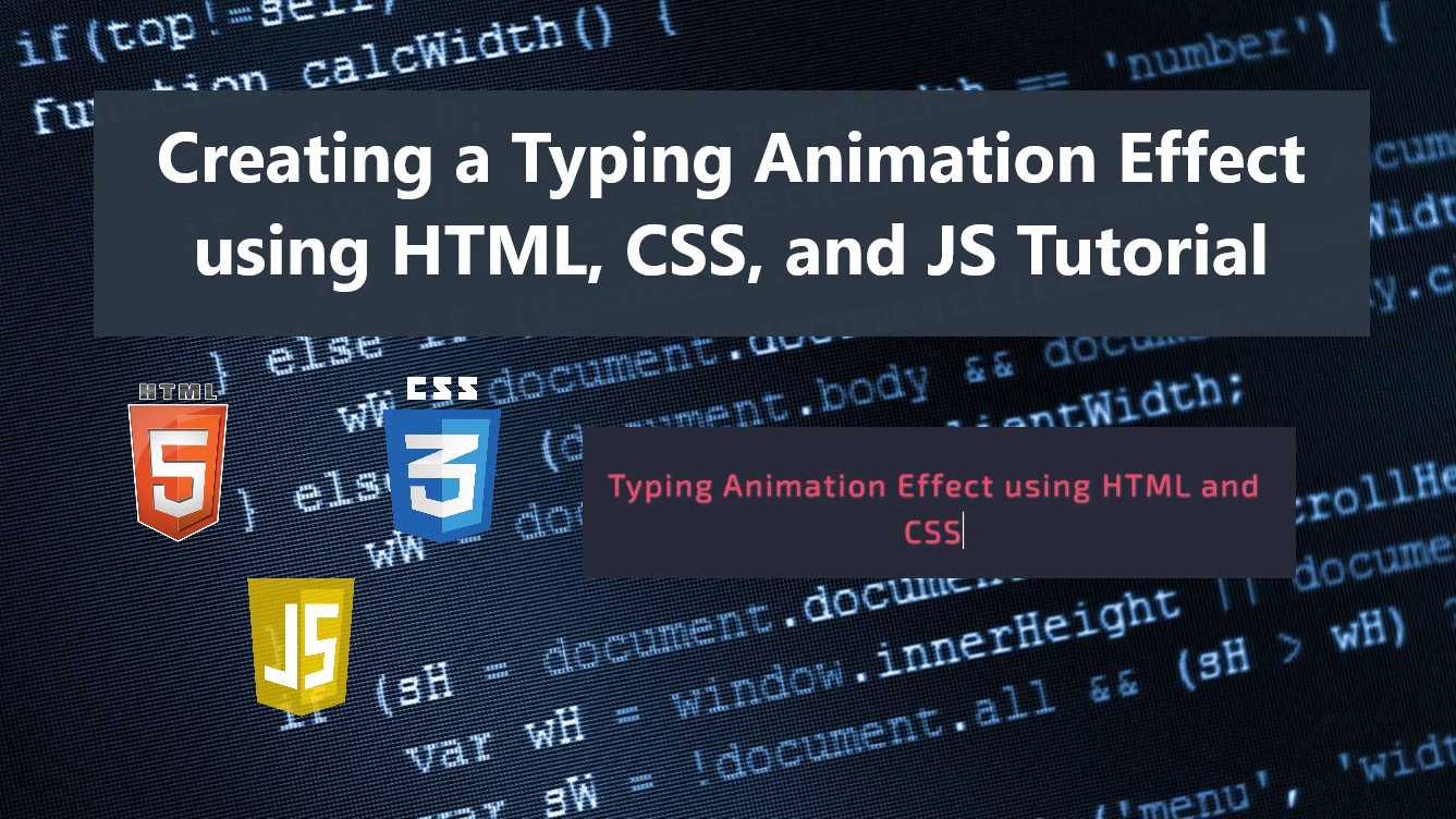
Creating a Typing Animation Effect using HTML, CSS, and JS Tutorial
In this tutorial, you can learn to create a simple Typing Animation Effect Tutorial using HTML, CSS, and JS. The tutorial aims to provide students and beginners with a reference for learning how to create an interactive component animation for websites or web applications. Here, I will be providing a simple web page script that demonstrates the creation of a simple typing animation.
What is Typing Animation?
Basically, Typing Animation Effect is an element or component text animation of a website or web application which looks like live typing. Some developers used this type of animation to create interactive websites to provide their visitors with a better experience when they are using their sites or project.
How to create a Typing Animation Effect?
In websites or web applications, we can achieve Typing Animation using HTML elements, CSS properties/keyframes, and JavaScript built-in event listeners, methods, and APIs. We can simply add a class name or identification name to the HTML element that we want to put in a typing animation. Next, using the CSS scripts, we can simply design the text content and the typing cursor of the said animation. The JavaScript will make the animation functional and splits the characters of the element's text content to easily identify each to show it one by one which results in a typing animation. To understand it more and have an idea to achieve it in an actual script, check out the web page scripts that I created and provided below.
Sample Web Page
The scripts below result in a simple web page that display simple static content with Typing Animation Effect.
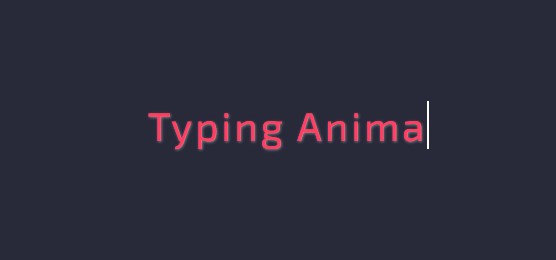
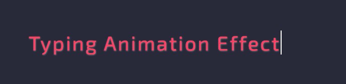
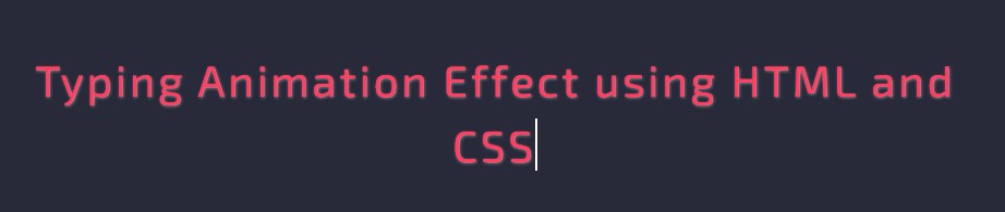
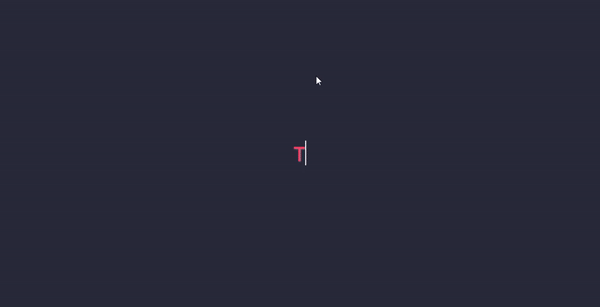
Page Interface
Here's the HTML file script known as index.html. It contains the page layout and animated text content element scripts.
- <!DOCTYPE html>
- <html lang="en">
- <head>
- <meta charset="UTF-8">
- <meta http-equiv="X-UA-Compatible" content="IE=edge">
- <meta name="viewport" content="width=device-width, initial-scale=1.0">
- <link rel="preconnect" href="https://fonts.googleapis.com">
- <link rel="preconnect" href="https://fonts.gstatic.com" crossorigin>
- <link rel="stylesheet" href="https://fonts.googleapis.com/css2?family=Material+Symbols+Outlined:opsz,wght,FILL,GRAD@48,400,0,0" />
- <link rel="stylesheet" href="https://cdn.jsdelivr.net/npm/[email protected]/dist/css/bootstrap.min.css">
- <link rel="stylesheet" href="style.css">
- <script src="https://cdn.jsdelivr.net/npm/[email protected]/dist/js/bootstrap.bundle.min.js"></script>
- </head>
- <body>
- <div class="content-md-lg py-3 h-100 d-flex align-items-center">
- <div class="col-lg-8 col-md-10 col-sm-12 col-12 mx-auto">
- </div>
- </div>
- </body>
- </html>
CSS
Next, here's the CSS file script named style.css. The file contains the stylesheet codes for the design of some elements and the page layout of the web page.
- @import url('https://fonts.googleapis.com/css2?family=Exo+2:ital,wght@0,100;0,200;0,300;0,400;0,500;0,600;0,700;0,800;0,900;1,100;1,200;1,300;1,400;1,500;1,600;1,700;1,800;1,900&display=swap');
- *{
- box-sizing: border-box;
- font-family: 'Exo 2', sans-serif;
- }
- /**
- Page Design
- */
- body,
- html{
- height: 100%;
- width: 100%;
- margin: 0;
- padding: 0;
- overflow-x:hidden;
- }
- body{
- background-color: #282A3A;
- }
- .page-title{
- font-size: 2.5rem;
- font-weight: 500;
- color: #fff;
- letter-spacing: 3px;
- font-family: var(--secular-font);
- text-align: center;
- text-shadow: 0px 0px 3px #2020208c;
- }
- .border-dark-subtle{
- border-color: var(--border-dark-subtle) !important;
- }
- /* Typing Animation Character Design*/
- .animate-typing>span:not(:nth-last-child(1)){
- color: #ff3e61;
- font-weight: 400;
- text-shadow: 1px 1px 3px #ffffff6e;
- }
- /* Typing Cursor Design */
- .animate-typing>span:nth-last-child(1){
- border-left:2px solid #fff;
- animation: blink 1s step-end infinite;
- }
- /* Animate Typing Cursor to blinking */
- @keyframes blink {
- 50%{
- visibility: hidden;
- }
- 100%{
- visibility: visible;
- }
- }
- /* Hide Element */
- .animate-typing>span.char-hide{
- display: none;
- }
JavaScript
Lastly, here is the JavaScript file known as script.js. The file contains the code that makes the Typing Animation possible.
- // Select All Typing Element
- const typingEl = document.querySelectorAll('.animate-typing')
- // Start Typing Animation
- const startTyping = (el) => {
- // Loop All Characters in Element
- [...el.querySelectorAll('span')].every(spanEl => {
- // Unhiding the first hidden span element
- if(spanEl.classList.contains('char-hide')){
- // Unhide Element
- spanEl.classList.remove('char-hide')
- if(el.querySelectorAll('span.char-hide').length == 0){
- /**
- * Check if all characters are rendered/shown
- * - If Yes unhide it again after 3s and rerun animation
- */
- setTimeout(()=>{
- el.querySelectorAll('span').forEach((spanEL2, i)=>{
- // Hide only the Charactes and not the cursor element
- if((i+1) < el.querySelectorAll('span').length)
- spanEL2.classList.add('char-hide')
- })
- // Rerun Animation
- startTyping(el)
- },3000)
- }else{
- setTimeout(()=>{
- // Rerun Animation
- startTyping(el)
- },100)
- }
- return false
- }
- return true
- })
- }
- // Initialize Typing Animation to All Elements that has a Typing Animation Class
- typingEl.forEach(el => {
- // Split All Characters
- var elTxtSplit = el.innerText.split("")
- // New Element HTML Content
- var newContent = ``;
- elTxtSplit.forEach(char =>{
- // Update Character enclosed in span element
- newContent += `<span class="char-hide">${char}</span>`;
- })
- // add typing cursor element
- newContent += `<span></span>`;
- // update the element content with the new content
- el.innerHTML = newContent
- // Start Animation
- startTyping(el)
- })
Snapshots
Here are the snapshots of the overall result of the web page scripts I have provided above.
DEMO
There you go! I have provide also the complete source code zip of the web page scripts that I gave above on this site and it is free to download. The download button can be found after this tutorial's content. Feel Free to Download and modify it to do some experiments.
That's it! I hope this Creating a Typing Animation Effect using HTML, CSS, and JS Tutorial will help you with what you are looking for and will be useful for your current and future web application projects.
Explore more on this website for more Tutorials and Free Source Codes.