In this tutorial, we are going to learn about simple responsive side bar menu using HTML JavaScript. This side bar is applicable to any gadgets. You can use it in your certain site.
It can cover up an unending number of sub menus, thus , gives infinite contents. This responsive menu can also be used with mobile devices of smaller screens for all the sub menus can just be stacked in the main menu. It can conserve space and accessible to devices of any size.
Directions:
First: Kindly copy the following code to the HEAD section of your page.
<meta name="viewport" content="width=device-width"> <link rel="stylesheet" type="text/css" href="style.css">
jQuery(function(){
sidebarmenu.init({
menuid: 'mysidebarmenu'
})
})
- style.css
- menu1.js
- menu_js.js
Second: Simply copy the code below to the BODY section of your page.
<nav id="mysidebarmenu" class="sidebarmenu">
<li><a href="http://www.sourcecodester.com/">Home
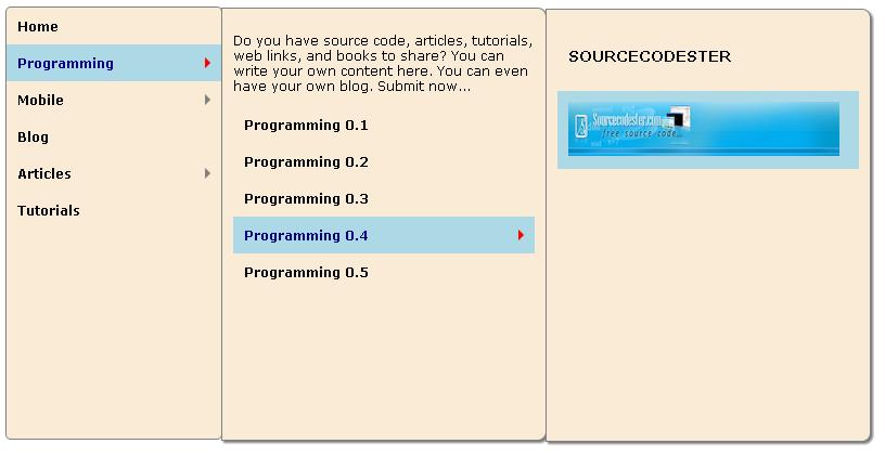
</a></li> <li><a href="#">Programming
</a> <p>Do you have source code, articles, tutorials, web links, and books to share? You can write your own content here. You can even have your own blog. Submit now...
</p>
<li><a href="#">Programming 0.1
</a></li> <li><a href="#">Programming 0.2
</a></li> <li><a href="#">Programming 0.3
</a> <li><a href="#">Programming 0.4
</a> <p><h3><a href="http://www.sourcecodester.com/">SOURCECODESTER
</a></h3> <a href="http://www.sourcecodester.com/"><img src="images/logo.jpg" width="250px" height="50px"></a>
<li><a href="#">Programming 0.5
</a></li> <li><a href="#">Mobile
</a> <li><a href="#">Mobile 1.1
</a></li> <li><a href="#">Mobile 1.2
</a></li> <li><a href="#">Mobile 1.3
</a> <li><a href="#">Mobile 1.4
</a></li> <li><a href="#">Mobile 1.5
</a></li> <li><a href="#">Mobile 1.6
</a></li> <li><a href="#">Mobile 1.7
</a></li> <li><a href="#">Articles
</a> <li><a href="#">Articles 2.1
</a></li> <li><a href="#">Articles 2.2
</a></li> <li><a href="#">Articles 2.3
</a></li> <li><a href="#">Articles 2.4
</a></li> <li><a href="#">Articles 2.5
</a></li> <li><a href="#">Articles 2.6
</a></li> <li><a href="#style/">Tutorials
</a></li> </nav>