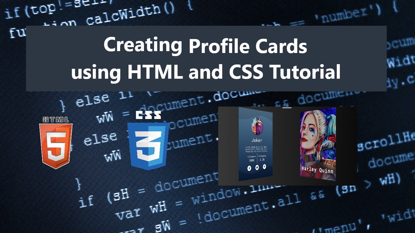
Creating Profile Cards using HTML and CSS Tutorial
In this tutorial, you can learn how to create interactive Profile Cards using HTML and CSS. The tutorial aims to provide students and beginners with a reference for learning some HTML and CSS Tricks for creating an interactive component of a website or web application. Here, I will be providing simple web page scripts that demonstrate the creation of simple interactive Profile Cards.
What is Profile Card?
A Profile Card is a block or container component of a website that contains the user or individual information. This card or container is often implemented with user or individual images or avatars, basic information, and some other data of users in the system.
How to Create an Interactive Profile Cards?
Profile Cards can be easily achieved using only HTML and CSS. We can simply create the card elements that are needed for the said component including the elements of the user or individual information blocks. With the help of the CSS scripts, we can design the card according to our requirements or desire on how it would look like. Also, using the CSS we can add simple animation such as Card Flipping Animation to the component to give the end-user a better experience while using or exploring the site. Check out the web page scripts that I created and provided below to know more about creating an interactive Profile Card.
Sample Web Page
The scripts below result in a simple web application page that demonstrate the creation of an interactive Profile Card. The page contains 2 profile cards which have front and back face that contains the user information. The details of the user will be shown by hovering over the cards and it will flip to the other side of the card which contains the complete information of the user.
HTML
Here's the HTML script known as index.html. The file contains the page layout and profile card elements.
- <!DOCTYPE html>
- <html lang="en">
- <head>
- <meta charset="UTF-8">
- <meta name="viewport" content="width=device-width, initial-scale=1.0">
- <link rel="stylesheet" href="style.css">
- <link rel="preconnect" href="https://fonts.googleapis.com">
- <link rel="preconnect" href="https://fonts.gstatic.com" crossorigin>
- <link rel="stylesheet" href="https://use.fontawesome.com/releases/v5.15.4/css/all.css" integrity="sha384-DyZ88mC6Up2uqS4h/KRgHuoeGwBcD4Ng9SiP4dIRy0EXTlnuz47vAwmeGwVChigm" crossorigin="anonymous"/>
- </head>
- <body>
- <div class="container">
- <hr id="title_hr">
- <div id="profile-card-wrapper">
- <div class="profile-card">
- <div class="profile-card-content">
- <div class="pc-front-face">
- <div class="profile-img">
- <img src="./joker.jpg" alt="Sample Profile Image">
- </div>
- </div>
- <div class="pc-back-face">
- <div class="profile-img">
- <img src="./joker.jpg" alt="Sample Profile Image">
- </div>
- <div class="profile-other-details">
- <div>
- </div>
- <div>
- </div>
- </div>
- <div class="profile-socials">
- </div>
- </div>
- </div>
- </div>
- <div class="profile-card">
- <div class="profile-card-content">
- <div class="pc-front-face">
- <div class="profile-img">
- <img src="./harley-quinn.jpg" alt="Sample Profile Image">
- </div>
- </div>
- <div class="pc-back-face">
- <div class="profile-img">
- <img src="./harley-quinn.jpg" alt="Sample Profile Image">
- </div>
- <div class="profile-other-details">
- <div>
- </div>
- <div>
- </div>
- </div>
- <div class="profile-socials">
- </div>
- </div>
- </div>
- </div>
- </div>
- </div>
- </body>
- </html>
Wave SVG
In the CSS scripts that I will be providing, some of the elements used the following wave SVG. Save this SVG file as wave-bg.svg.
- <svg xmlns="http://www.w3.org/2000/svg" viewBox="0 0 1440 320"><path fill="#273036" fill-opacity="0.5" d="M0,64L80,96C160,128,320,192,480,186.7C640,181,800,107,960,74.7C1120,43,1280,53,1360,58.7L1440,64L1440,320L1360,320C1280,320,1120,320,960,320C800,320,640,320,480,320C320,320,160,320,80,320L0,320Z"></path></svg>
Page Layout Design
Here is the CSS script that contains the page layout design.
- @import url('https://fonts.googleapis.com/css2?family=Roboto+Mono:ital,wght@0,100;0,200;0,300;0,400;0,500;0,600;1,100;1,200;1,300;1,400;1,500;1,600&display=swap');
- *{
- margin: 0;
- padding: 0;
- box-sizing: border-box;
- font-family: 'Roboto Mono', monospace;
- }
- .material-symbols-outlined {
- font-variation-settings:
- 'FILL' 0,
- 'wght' 400,
- 'GRAD' 0,
- 'opsz' 48
- }
- ::selection{
- color: #fff;
- background: #4db2ec;
- }
- body{
- display: flex;
- align-items: center;
- justify-content: center;
- min-height: 100vh;
- background: #1e1f1f;
- background-image: linear-gradient(to right, #434343 0%, black 100%);
- }
- #page-title{
- color: #fff;
- text-align: center;
- font-weight: 500;
- }
- #title_hr{
- width:60px;
- border: 2px solid #ffffff;
- margin: .35em auto;
- }
Cards Container Design
Next, here are the stylesheet scripts of the card wrapper and container designs.
- /* Profile Card Wrapper */
- #profile-card-wrapper{
- display: flex;
- flex-wrap: wrap;
- width: 100%;
- justify-content: space-evenly;
- align-items: center;
- padding: .35em;
- }
- /* Profile Card Container */
- .profile-card{
- position:relative;
- height: 400px;
- width: 300px;
- perspective: 1200px;
- margin-bottom: .35em;
- }
- /* Profile Card Content Container */
- .profile-card-content{
- position:relative;
- display: flex;
- flex-direction: column;
- justify-content: center;
- align-items: center;
- height: 100%;
- width: 100%;
- transition: transform .7s ease-in;
- transform-style: preserve-3d;
- }
- .profile-card:hover .profile-card-content{
- transform: rotateY(-180deg);
- }
Cards Face Design
Next, here are the custom CSS scripts for the design of the card's front and back faces. It also includes the script of the flip animation of the card when hovering over it.
- /* Profile Card Faces Container */
- .profile-card .pc-front-face,
- .profile-card .pc-back-face{
- position: absolute;
- width: 100%;
- height: 100%;
- top:0;
- left:0;
- backface-visibility: hidden;
- }
- .profile-card .pc-back-face{
- background-color: #6a85b6;
- transform: rotateY(180deg);
- /* background-image: linear-gradient(to top, #6a85b6 0%, #bac8e0 100%); */
- background-image: linear-gradient(to top, #09203f 0%, #537895 100%);
- display: flex;
- flex-direction: column;
- justify-content: center;
- align-items: center;
- }
- .pc-back-face:before {
- content: "";
- position: absolute;
- width: 100%;
- height: 19%;
- background-image: url(./wave-bg.svg);
- background-repeat: no-repeat;
- background-size: cover;
- background-position: bottom left;
- top: 0;
- left: 0;
- filter: opacity(0.5);
- z-index: 0;
- transform:rotateY(180deg) rotateX(180deg);
- }
- .pc-back-face:after {
- content: "";
- position: absolute;
- width: 100%;
- height: 19%;
- background-image: url(./wave-bg.svg);
- background-repeat: no-repeat;
- background-size: cover;
- background-position: bottom left;
- bottom: 0;
- left: 0;
- filter: opacity(0.5) brightness(0);
- z-index: 0;
- }
- .pc-back-face>div{
- z-index: 1;
- }
Cards Content Design
Lastly, here are the CSS scripts of the card contents. It includes the style script for the design of the user image in front and back face, name, and other information.
- /* Profile Images */
- .profile-card .pc-front-face .profile-img{
- position: absolute;
- width: 100%;
- height: 100%;
- top:0;
- left:0;
- filter: brightness(0.75);
- }
- .profile-card .pc-back-face .profile-img{
- width: 100px;
- height: 100px;
- border-radius: 50% 50%;
- overflow: hidden;
- box-shadow: 2px 2px 7px #000000b3;
- }
- .profile-card .profile-img>img{
- width: 100%;
- height: 100%;
- object-fit: cover;
- object-position: center;
- }
- /* Profile Names */
- .profile-card .pc-front-face .profile-name{
- position: absolute;
- display: flex;
- flex-wrap: wrap;
- align-items: center;
- justify-content: center;
- height: 50%;
- width: 100%;
- bottom: 0;
- left: 0;
- /* background-color: #0000007c; */
- background-image: url(./wave-bg.svg);
- background-size: cover;
- background-repeat: no-repeat;
- background-position: top left;
- padding: 0.35em 0.35em;
- padding-top: 100px;
- }
- .profile-card .pc-front-face .profile-name>span{
- color: #fff;
- font-size: 2rem;
- letter-spacing: 3px;
- font-weight: 600;
- text-align: center;
- }
- .profile-card .pc-back-face .profile-name {
- color: #f1e3e3;
- padding: 0.5em 0;
- font-size: 1.75rem;
- letter-spacing: 2px;
- font-weight: 500;
- text-shadow: 1px 1px 3px #000000ad;
- }
- /* Profile Description */
- .profile-card .pc-back-face .profile-description {
- display: -webkit-box;
- overflow: hidden;
- color: #fff;
- font-size: 0.75rem;
- text-align: center;
- padding: 0 1.5em;
- line-height: .8rem;
- font-weight: 200;
- text-shadow: 0px 0px 3px #000;
- text-overflow: ellipsis;
- -webkit-line-clamp: 3;
- -webkit-box-orient: vertical;
- }
- /* Profile Other Details */
- .profile-card .pc-back-face .profile-other-details {
- width: 100%;
- padding: 0.35em 0.75em;
- display: flex;
- justify-content: center;
- }
- .profile-card .pc-back-face .profile-other-details>div {
- padding: 0.35em 0.75em;
- }
- .profile-card .pc-back-face .profile-other-details>div:has(~ div) {
- border-right: 1px solid #a7a7a7;
- }
- .profile-card .pc-back-face .profile-other-details>div label{
- color: #e1e1e1;
- font-size: .8rem;
- text-shadow: 0px 0px 3px #0000008f;
- }
- .profile-card .pc-back-face .profile-other-details>div div {
- color: #e1e1e1;
- font-size: 1.2rem;
- text-shadow: 0px 0px 3px #0000008f;
- text-align: center;
- }
- .profile-card .pc-back-face .profile-socials{
- width:80%;
- display: flex;
- flex-wrap: wrap;
- justify-content: space-evenly;
- align-items: center;
- padding: 0.35em 0;
- }
- .profile-card .pc-back-face .profile-socials a {
- text-decoration: none;
- text-transform: none;
- background: #fff;
- width: 30px;
- height: 30px;
- border-radius: 50% 50%;
- display: flex;
- align-items: center;
- justify-content: center;
- box-shadow: 1px 1px 5px #00000061;
- color: #181818;
- transition: transform .2s ease-in-out;
- }
- .profile-card .pc-back-face .profile-socials a:hover{
- transform: scale(1.1);
- }
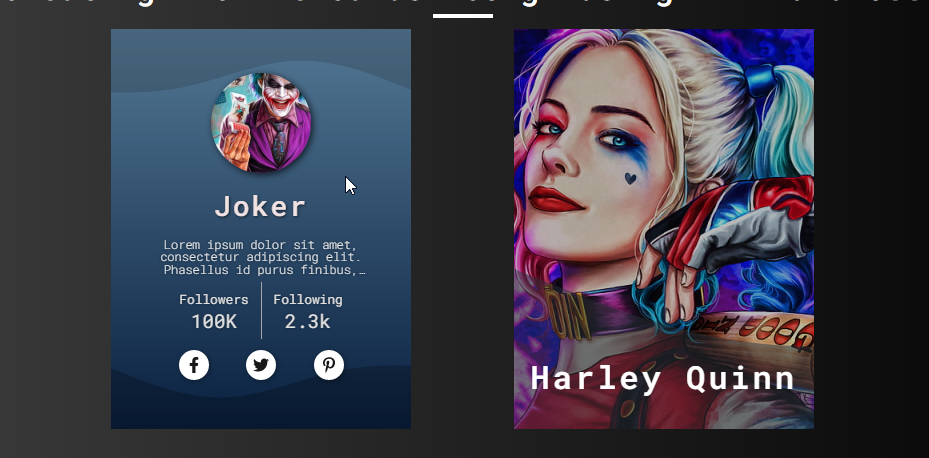
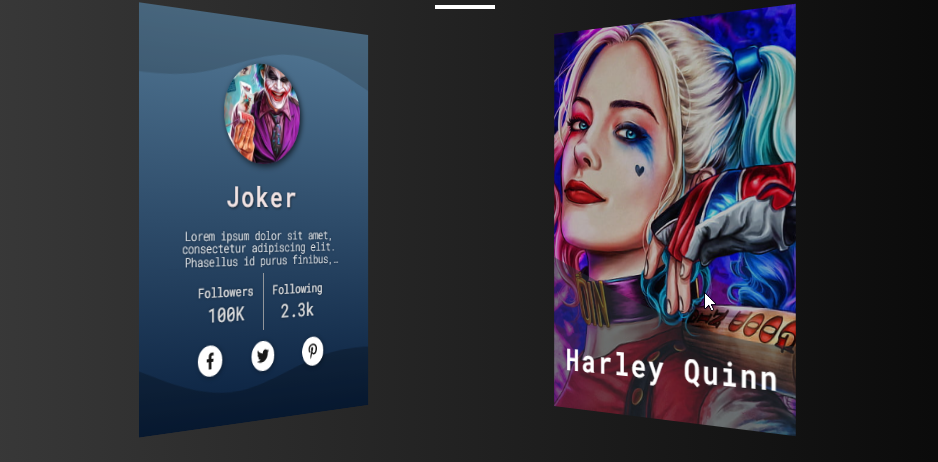
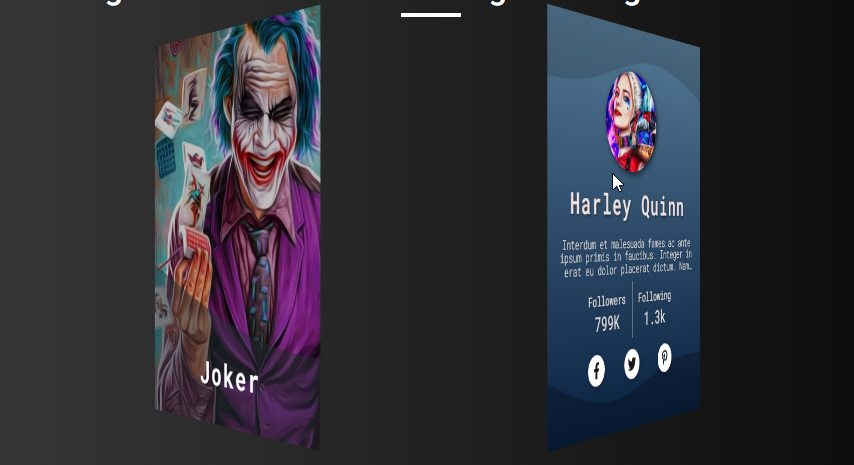
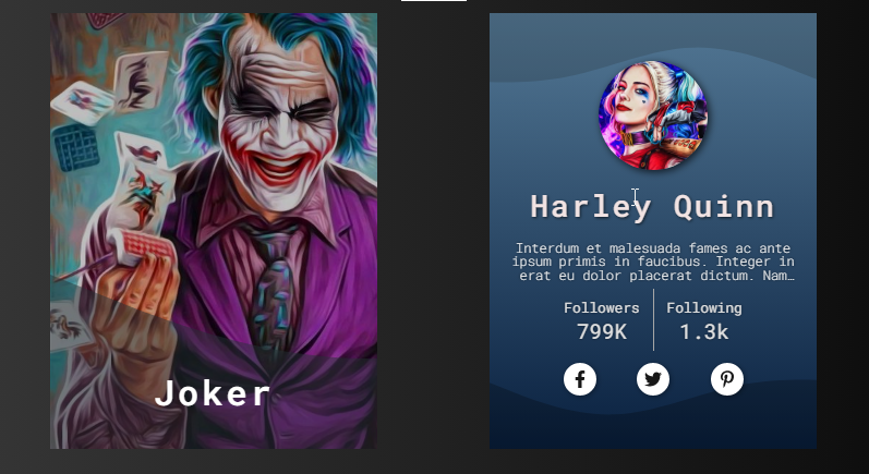
Snapshots
The images below are the overall result of the web page scripts I have provided above.
Page UI (Back Face [left card] and Front Face [right card])
Cards Flipping Image #1
Cards Flipping Image #2
Cards Flipped
There you go! I have also provided the complete source code zip file of the web page scripts I provided on this website and it is free to download. The download button can be found below this tutorial's content. Feel free to download and modify the source code the way you wanted to do some experiments and enhance your programming capabilities.
That's it! I hope this Interactive Profile Cards using HTML and CSS Tutorial will help you with what you are looking for and will be useful for your current and future web application projects.
Explore more on this website for more Tutorials and Free Source Codes.