Creating a Floating Input Placeholder/Label using HTML and CSS Tutorial
In this tutorial, you can learn how to create a Floating Input Label or Placeholder using HTML and CSS only. The main purpose of this tutorial is to provide students and beginners with a reference for learning some CSS tricks that are helpful for their current or future projects. Here, I will be providing the scripts of a sample web page that demonstrate the creation of floating input labels or placeholders using HTML and CSS only.
What is a Floating Input Placeholder/Label
The Floating Input Placeholder/Label is one of the most used UI features of websites nowadays. This feature doesn't affect any data or content of a website. It is mainly implemented just to give a better experience to the end-users while filling in the form fields. The floating input label/placeholder act as the input placeholder for unfilled or empty values input field and then converts as an input label when the field is focused and filled.
How to create a Floating Input Placeholder/Label?
The Floating Input Placeholder/Label can be easily achieved using only HTML and CSS. Using the Cascading Stylesheet (CSS) we can simply customize the input fields labels and placeholders using the CSS pseudo-elements, selectors, properties, and a little transition and animation to make it more interactive. We can use the CSS :placeholder-shown pseudo-class to detect if the input is filled or not. Check out the sample web page scripts below to understand it more.
Sample Web Form Page
Here are the scripts of a sample web application's form page that demonstrate how to create a floating input placeholder or label. The program will result in a simple form containing 3 input fields and the first input field is already filled by default or on page load.
HTML
Here's the HTML file script of the form page which contains the script of the page and form layout. It also contains the input and label elements which are the important elements for this tutorial.
- <!DOCTYPE html>
- <html lang="en">
- <head>
- <meta charset="UTF-8">
- <meta http-equiv="X-UA-Compatible" content="IE=edge">
- <meta name="viewport" content="width=device-width, initial-scale=1.0">
- <link rel="preconnect" href="https://fonts.googleapis.com">
- <link rel="preconnect" href="https://fonts.gstatic.com" crossorigin>
- <link rel="stylesheet" href="https://fonts.googleapis.com/css2?family=Material+Symbols+Outlined:opsz,wght,FILL,[email protected],100..700,0..1,-50..200" />
- <link rel="stylesheet" href="style.css">
- </head>
- <body>
- <main>
- <section>
- <hr style="width: 50px;">
- </section>
- <section>
- <form action="" id="sample-form" autocomplete="off">
- <div class="form-container">
- <div class="fields">
- <div class="form-field">
- <input type="text" id="name" value="Mark Cooper" placeholder=" ">
- </div>
- <div class="form-field">
- <input type="text" id="username" placeholder=" ">
- </div>
- <div class="form-field">
- <input type="email" id="email" placeholder=" ">
- </div>
- </div>
- </div>
- </form>
- </section>
- </main>
- </body>
- </html>
Page Layout Design
Here's the default page layout and design. The CSS script below does not contain the inputs, labels, and placeholder design yet.
- @import url('https://fonts.googleapis.com/css2?family=Rubik&display=swap');
- body *{
- font-family: 'Rubik', sans-serif;
- box-sizing: border-box;
- }
- /**
- Page Design
- */
- body,
- html{
- height: 100%;
- width: 100%;
- margin: 0;
- padding: 0;
- }
- body{
- background-color: #efefef;
- }
- main{
- padding: 2em 5em;
- overflow-x: auto;
- width: 720px;
- margin: auto;
- }
- /*mobile devices*/
- @media (max-width:720px) {
- main{
- width: 100%;
- padding: 2em .5em;
- }
- }
- .text-center{
- text-align: center;
- }
- .text-body{
- color: #919191;
- font-size: smaller;
- }
- .form-container{
- width: 500px;
- background-color: #fff;
- border: 1px solid #d6d6d6;
- box-shadow: 2px 2px 7px #5d5d5d;
- min-height: 50px;
- margin: auto;
- padding:2em 1.5em;
- }
- @media (max-width:500px) {
- .form-container{
- width: 100%;
- }
- }
Using the HTML and the default Stylesheet scripts that I provided above will result in something like the following image:
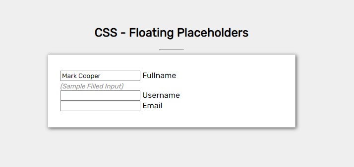
Form and Input Fields Design
Here's the script for the design of the Form Container and Input Fields.
- /* Form Field Styles */
- .form-field{
- width: 100%;
- position: relative;
- margin-top: 1em;
- }
- .form-field input{
- display: block;
- width: 100%;
- padding: 0.75em 0.35em;
- border: none;
- outline: none;
- border-bottom: 1px solid #bbbbbb;
- transition: all .3s cubic-bezier(0.075, 0.82, 0.165, 1);
- }
- .form-field label{
- position: absolute;
- top: .75em;
- left: .75em;
- color:#c9c9c9 ;
- transition: all .3s ease-in-out;
- }
Floating Placeholder/Label Design and Animation
Then, here's the CSS script for the design of the input field and label/placeholder when the fields are in focus or filled.
- /* Form Field Filled/Focused Input Styles */
- .form-field input:not(:placeholder-shown),
- .form-field input:focus{
- border-bottom: 1px solid #3e3e3e;
- }
- .form-field input:not(:placeholder-shown) ~ label,
- .form-field input:focus ~ label{
- top: -1em;
- left: 0;
- font-size: small;
- color:#5b5b5b ;
- }
- .form-field:has(input:focus):before{
- content: "";
- width: 100%;
- position: absolute;
- border-bottom: 1px solid #e7e5e5;
- right: 0;
- bottom: 0;
- animation: border-reveal .3s ease-in-out forwards;
- }
- /* Animation keyframe */
- @keyframes border-reveal{
- 0%{
- width: 100%;
- }
- 100%{
- width: 0%;
- }
- }
Note that the script above requires the input to have a placeholder attribute with at least a space value so that the application can detect if the input is filled or not.
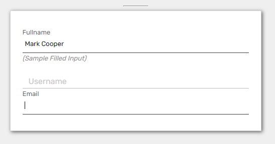
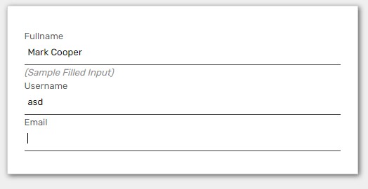
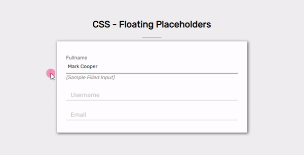
Snapshots
Focused Input Fields
With Filled Input Fields
Demo
There you go! I have also provided the source code zip file that I created for this tutorial on this site. Feel free to download it by clicking the download button located below this tutorial's content.
That's it! I hope this Creating a Floating Input Placeholder/Label using HTML and CSS Tutorial will help you with what you are looking for and will be useful for your current and future web application projects.
Explore more on this website for more Tutorials and Free Source Codes.