In this tutorial, you can learn how to create a simple Custom Select Box with Search Bar using CSS and JavaScript. The tutorial aims to provide students and beginners with a reference to learn with for creating a useful web application or website component. Here, I will be providing a sample web page script that demonstrates the creation of a Custom Select Box with a Search Bar.
What is Select Box?
The Select Box is an HTML Element used to create a drop-down list. It is usually used in a form with an input field that allows the user to select a value from multiple options. In HTML, we can simply create a select box using <select> tag, and the options are listed inside this tag enclosed in <option> tag for each item.
How to Create a Custom Select Box with Search Bar?
The Custom Select Box with Search Bar can be easily achieved using CSS and JavaScript. To do that, we need to create a new element that will represent the select box and hide the original select box. After that, we can design the select box using the CSS code. Then, using some JavaScript event listeners, methods, built-in APIs, and functions, we can make the custom select box functional and update the hidden original box value with the item selected on the custom one. Check out the sample web page script that I created and provided below to understand more about creating the custom select box.
Sample Web Page
The scripts below result in a simple web page that contains a custom select box. The custom select box contains a search feature that allows the user to search items using keywords. When the item is selected, the custom select box selected item text will be updated and the hidden select element will be also updated.
HTML
Here's the HTML file script of the page layout and select box element.
<!DOCTYPE html>
<meta http-equiv="X-UA-Compatible" content="IE=edge"> <meta name="viewport" content="width=device-width, initial-scale=1.0"> <link rel="preconnect" href="https://fonts.googleapis.com"> <link rel="preconnect" href="https://fonts.gstatic.com" crossorigin> <link rel="stylesheet" href="https://fonts.googleapis.com/css2?family=Material+Symbols+Outlined:opsz,wght,FILL,[email protected],100..700,0..1,-50..200" /> <link rel="stylesheet" href="style.css"> <link rel="stylesheet" href="custom-select.css"> <div class="page-title">Creating a Simple Select Box using CSS and JavaScript
</div> <hr style="margin:auto; width:25px"> <div id="select-wrapper"> <select name="sampleSelect" id="sampleSelect">
Page Layout Stylesheet
Next, here's the CSS script that contains the code for the design of the page layout.
@import url('https://fonts.googleapis.com/css2?family=Courgette&family=Secular+One&display=swap" rel="stylesheet');
:root{
--secular-font: 'Secular One', sans-serif;
}
*{
box-sizing: border-box;
}
body *{
font-family: 'Rubik', sans-serif;
}
/**
Page Design
*/
body,
html{
height: 100%;
width: 100%;
margin: 0;
padding: 0;
}
body{
background-color: #B9F3E4;
}
/* Page Wrapper */
#wrapper{
width: 100%;
padding: 3em 5em;
}
.page-title{
font-size: 2.5rem;
font-weight: 500;
color: #fff;
letter-spacing: 3px;
font-family: var(--secular-font);
text-align: center;
text-shadow: 0px 0px 3px #2020208c;
}
/* Select box Wrapper */
#select-wrapper{
position: relative;
width: 300px;
margin:auto;
margin-top:3em
}
Custom Select Box Stylesheet
Next, here's the CSS script that contains the code for the design of the custom select box.
.custom-select-box-parent{
position: relative;
width: 100%;
}
.custom-select-box-container{
width: 100%;
display: flex;
flex-wrap: wrap;
padding:.35em .5em;
background-color: #ffffff;
border:1px solid #eeeeee;
min-height: 1.2em;
justify-content: space-between;
box-shadow: 1px 1px 3px #3d3d3d52;
cursor: pointer;
}
.custom-select-box-selected{
width: 90%;
font-size: .9rem;
font-weight: 400;
}
.custom-select-box-dd-icon{
width: 10%;
transition: all .3s ease;
position:relative;
}
.custom-select-box-dd-icon:before{
content: "\25BE";
position:absolute;
top:0;
transform: translateX(50%);
}
.custom-select-box-parent.show .custom-select-box-dd-icon{
transform: rotate(180deg);
}
.custom-select-box-options-container{
width: 100%;
position: absolute;
background-color: #fff;
border:1px solid #e7e7e7;
margin-top:.5em;
box-shadow:0px 0px 5px #2727272d;
display: none;
}
.custom-select-box-parent.show .custom-select-box-options-container{
display: block;
}
.custom-select-box-search{
position: relative;
width: 100%;
padding: .35em;
}
.custom-select-box-search:before {
content: "";
width: 30px;
height: calc(100% - 0.7em);
position: absolute;
z-index: 2;
background: transparent url("data:image/svg+xml,%3Csvg xmlns='http://www.w3.org/2000/svg' width='16' height='16' class='bi bi-search' viewBox='0 0 16 16'%3E%3Cpath d='M11.742 10.344a6.5 6.5 0 1 0-1.397 1.398h-.001c.03.04.062.078.098.115l3.85 3.85a1 1 0 0 0 1.415-1.414l-3.85-3.85a1.007 1.007 0 0 0-.115-.1zM12 6.5a5.5 5.5 0 1 1-11 0 5.5 5.5 0 0 1 11 0z'%3E%3C/path%3E%3C/svg%3E") no-repeat center;
}
.custom-select-box-search-box{
width: 100%;
padding:.35em 0.35em .35em 30px;
font-size: .9rem;
color:#333333;
outline:none;
border:1px solid #bbbbbb;
}
.custom-select-box-search-box:focus{
border-color: #a0a0a0;
box-shadow: 0px 0px 5px #2727272d;
}
.custom-select-box-options{
position:relative;
margin-top:.35em;
width: 100%;
max-height:35vh;
overflow-y: auto;
padding:.35em .2em
}
/* width */
.custom-select-box-options::-webkit-scrollbar {
width: 5px;
}
/* Track */
.custom-select-box-options::-webkit-scrollbar-track {
background: #f1f1f1;
}
/* Handle */
.custom-select-box-options::-webkit-scrollbar-thumb {
background: #888;
border-radius: 5px;
}
/* Handle on hover */
.custom-select-box-options::-webkit-scrollbar-thumb:hover {
background: #555;
}
.custom-select-box-item{
background: #fff;
width: 100%;
padding: .35em .5em;
border:1px solid #e9e9e9;
cursor: pointer;
}
.custom-select-box-item:hover,
.custom-select-box-item[data-selected="true"]{
background: #e6e6e6;
}
JavaScript
Next, here's the JavaScript object-oriented script that was created that creates the custom select box and handles the component's functionality codes.
/** Custom Select Box */
class CustomSelectBox{
/** Parent Element */
selectParentEl = document.createElement('div')
/** Custom Select Box HTML */
selectHTML = `<div class="custom-select-box-container">
<div class="custom-select-box-selected">Please Select here</div>
<span class="custom-select-box-dd-icon"></span>
</div>
<div class="custom-select-box-options-container">
<div class="custom-select-box-search">
<input type="search" class="custom-select-box-search-box">
</div>
<div class="custom-select-box-options">
</div>
</div>`;
optionItemEl = document.createElement('div')
constructor(){
this.selectParentEl.classList.add('custom-select-box-parent')
this.selectParentEl.innerHTML = this.selectHTML
this.optionItemEl.classList.add('custom-select-box-item')
this.selectParentEl.addEventListener('click', this.showSelect.bind(this))
}
init(el){
/** Initialize Custo Select Box */
el.style.display = `none`;
el.after(this.selectParentEl)
var selOpts = el.querySelectorAll('option')
/** Append Items */
selOpts.forEach(option => {
var optEl = this.createElfromOption(option)
this.selectParentEl.querySelector('.custom-select-box-options').appendChild(optEl)
})
/** Add Click Event for Selecting Item */
this.selectParentEl.querySelectorAll('.custom-select-box-item').forEach(item =>{
item.addEventListener('click', this.selectItem.bind(this, item, el))
})
/** trigger Search */
this.selectParentEl.querySelector('.custom-select-box-search-box').addEventListener('input', this.selectSearch.bind(this))
}
/** Show custom option block */
showSelect(){
this.selectParentEl.classList.add('show')
document.addEventListener('click', this.closeSelect.bind(this))
}
/** close custom option block */
closeSelect(e){
var selectBoxOptC = this.selectParentEl.outerHTML
if(selectBoxOptC.includes(e.target.outerHTML) == false){
this.selectParentEl.classList.remove('show')
document.removeEventListener('click', this.closeSelect)
this.resetSearch()
}
}
/** Search Item */
selectSearch(){
var search = this.selectParentEl.querySelector('.custom-select-box-search-box').value
this.selectParentEl.querySelectorAll('.custom-select-box-item').forEach(item =>{
if((item.innerText.toLowerCase()).includes(search.toLowerCase()) == true){
item.style.display = 'block'
}else{
item.style.display = 'none'
}
})
}
/** Reset Search box */
resetSearch(){
this.selectParentEl.querySelector('.custom-select-box-search-box').value = '';
this.selectSearch()
}
/** Selected Item function */
selectItem(item, el){
var val = item.dataset.value
var txt = item.innerText
if(this.selectParentEl.querySelector('.custom-select-box-item[data-selected="true"]') !== null)
this.selectParentEl.querySelector('.custom-select-box-item[data-selected="true"]').removeAttribute('data-selected')
item.dataset.selected = 'true'
if(el.querySelector('option[selected]') !== null)
el.querySelector('option[selected]').removeAttribute('selected')
if(el.querySelector('option') !== undefined){
el.querySelectorAll('option').forEach(option =>{
if(!!option.dataset.value){
if(option.dataset.value == val)
option.setAttribute('selected', true);
}else{
if(option.innerText == val)
option.setAttribute('selected', true);
}
})
}
this.selectParentEl.querySelector('.custom-select-box-selected').innerText = txt
setTimeout(()=>{
this.selectParentEl.classList.remove('show')
document.removeEventListener('click', this.closeSelect.bind(this))
this.resetSearch()
},100)
}
/** Create the Item form Option */
createElfromOption(option){
var val = option.dataset.value || option.innerText
var txt = option.innerText
var item = this.optionItemEl.cloneNode(true)
item.dataset.value= val
item.innerText= txt
return item
}
}
Initialize Custom Select Box
Lastly, here's the JS script that initializes or converts the HTML select element to a custom select box.
var customSelect = new CustomSelectBox()
customSelect.init(document.getElementById('sampleSelect'))
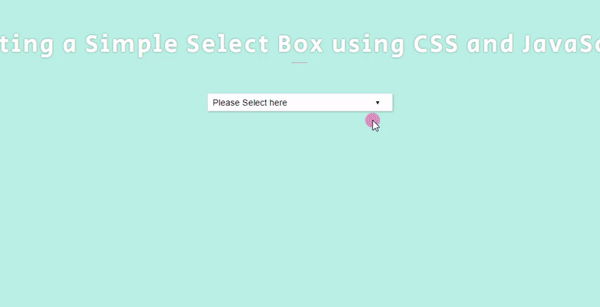
Snapshots
The following images or snapshot is the overall result of the web page scripts that I provided above.
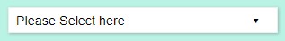
Custom Select Box
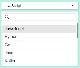
Option Block/Container is shown
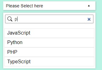
When Searching Item
DEMO
There you go! I have also provided the source code zip file of the sample web page on this site and it is free to download. To download the file, you can simply click the download button located below this tutorial's content. Feel free to download and do some experiments.
That's it! I hope this Creating a Custom Select Box using CSS and JavaScript Tutorial will help you with what you are looking for and will be helpful for your current and future web application projects.
Explore more on this website for more Tutorials and Free Source Codes.
Happy Coding =)