Creating a Pop out Corner Menu using HTML, CSS, and JS Tutorial
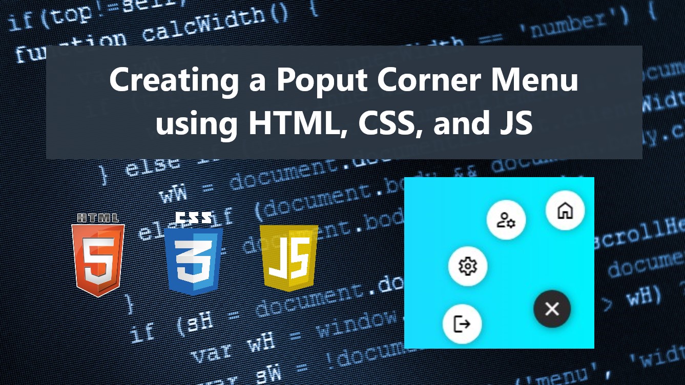
In this tutorial, you can learn to create a simple Pop out Corner Menu using HTML, CSS, and JS. This tutorial aims to provide students and beginners with a reference for learning to create a useful and interactive component. Here, I will be providing a simple web page script that demonstrates the creation of a simple pop-out corner menu.
What is Pop Out Corner Menu?
The Pop-Out Corner Menu is a component that displays a menu button at the corner of the web page at first and pops outs the menu item link when clicked or hovered over. This component is often used or implemented in mobile applications which can also help to optimize the page space.
How to create a Pop-out Corner Menu?
Pop-out Corner Menu can be easily achieved using CSS and a little bit of JavaScript codes. Using the CSS useful properties, we can design the corner menu elements on how we wanted it should look and add some simple animations. Then, using some of the built-in event listeners and methods of JavaScript, we can pop out and hide the menu items when hovering over or when clicking the menu button. Check out the sample web page scripts that I created below to have a better understanding of this.
Sample Web Page Scripts
The scripts below result in a simple web page that contains a corner menu that pops out the menu item links in the icon view when the menu button is clicked. The corner menu also has a simple transition and animation to make it more interactive to the users.
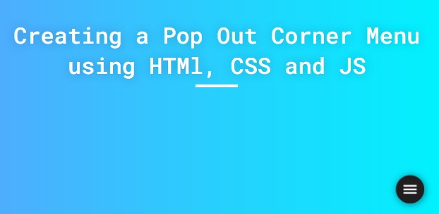
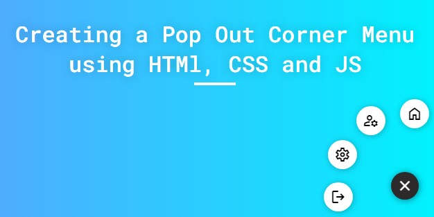
Page Interface
Here's the HTML file script known as index.html. This file contains the HTML elements that of the page especially the elements of the corner menu and its menu items.
- <!DOCTYPE html>
- <html lang="en">
- <head>
- <meta charset="UTF-8">
- <meta name="viewport" content="width=device-width, initial-scale=1.0">
- <link rel="stylesheet" href="style.css">
- <link rel="preconnect" href="https://fonts.googleapis.com">
- <link rel="preconnect" href="https://fonts.gstatic.com" crossorigin>
- <link rel="stylesheet" href="https://fonts.googleapis.com/css2?family=Material+Symbols+Outlined:opsz,wght,FILL,[email protected],100..700,0..1,-50..200" />
- </head>
- <body>
- <div class="container">
- <hr id="title_hr">
- </div>
- <div id="corner-menu-wrapper" class="">
- <div class="corner-menu-inner">
- <div class="corner-menu-btn-holder">
- </div>
- <div id="corner-menu-list">
- </div>
- </div>
- </div>
- </body>
- </html>
CSS
Next, here's the CSS file script known as style.css. This file contains the stylesheet codes of the page layout and corner menu elements designs.
- @import url('https://fonts.googleapis.com/css2?family=Dongle:wght@300;400;700&family=Roboto+Mono:ital,wght@0,100;0,200;0,300;0,400;0,500;0,600;1,100;1,200;1,300;1,400;1,500;1,600&display=swap" rel="stylesheet');
- *{
- margin: 0;
- padding: 0;
- box-sizing: border-box;
- font-family: 'Dongle', sans-serif;
- font-family: 'Roboto Mono', monospace;
- }
- ::selection{
- color: #fff;
- background: #4db2ec;
- }
- body{
- display: flex;
- align-items: center;
- justify-content: center;
- min-height: 100vh;
- background: #4facfe;
- background-image: linear-gradient(to right, #4facfe 0%, #00f2fe 100%);
- padding: 2em 0;
- }
- #page-title{
- color: #fff;
- text-align: center;
- font-weight: 500;
- text-shadow: 0px 0px 15px #0000003a;
- }
- #title_hr{
- width:60px;
- border: 2px solid #ffffff;
- margin: .35em auto;
- }
- @media (min-width: 780px){
- #page-title{
- width: 780px;
- }
- }
- /* Corner Menu Wrapper */
- div#corner-menu-wrapper {
- position: fixed;
- bottom: 25px;
- right: 25px;
- }
- /* Corner Menu Inner */
- .corner-menu-inner {
- position: relative;
- }
- /* Corner Menu Button Holder */
- .corner-menu-btn-holder{
- position: relative;
- z-index: 2;
- }
- /* Corner Menu Button */
- button#corner-menu-btn {
- width: 40px;
- height: 40px;
- display: flex;
- align-items: center;
- justify-content: center;
- background: #2c2b2b;
- outline: none;
- color: #fff;
- border: none;
- border-radius: 50%;
- box-shadow: 1px 1px 10px #00000070;
- cursor: pointer;
- transition:all .2s ease;
- animation: spin2 .4s ease forwards;
- }
- /* Corner Menu Button on hover */
- button#corner-menu-btn:hover{
- transform: scale(1.02);
- background: #131212;
- box-shadow: 1px 1px 10px #00000094;
- }
- #corner-menu-wrapper.show #corner-menu-btn{
- animation: spin .4s ease forwards;
- }
- /* Corner Menu Spin Animation Keyframes */
- @keyframes spin {
- 0%{
- rotate: 0deg;
- }
- 100%{
- rotate: 360deg;
- }
- }
- @keyframes spin2 {
- 0%{
- rotate: 360deg;
- }
- 100%{
- rotate: 0deg;
- }
- }
- div#corner-menu-list {
- position: absolute;
- bottom: 0;
- right: 0;
- z-index: 1;
- }
- a.corner-menu-item {
- background: #fff;
- display: flex;
- height: 42px;
- width: 42px;
- justify-content: center;
- align-items: center;
- text-decoration: none;
- color: #000;
- border-radius: 50%;
- box-shadow: 1px 1px 10px #00000045;
- transition: all .4s ease-in-out;
- opacity: 0;
- }
- a.corner-menu-item:nth-child(1) {
- transform: translate(1px, 127px) scale(.5);
- }
- a.corner-menu-item:nth-child(2) {
- transform: translate(1px, 85px) scale(.5);
- }
- a.corner-menu-item:nth-child(3) {
- transform: translate(1px, 43px) scale(.5);
- }
- a.corner-menu-item:nth-child(4) {
- transform: translate(1px, 1px) scale(.5);
- }
- #corner-menu-wrapper.show a.corner-menu-item{
- opacity: 1;
- }
- #corner-menu-wrapper.show a.corner-menu-item:nth-child(1) {
- transform: translate(15px, 23px) scale(1);
- }
- #corner-menu-wrapper.show a.corner-menu-item:nth-child(2) {
- transform: translate(-48px, -9px) scale(1);
- }
- #corner-menu-wrapper.show a.corner-menu-item:nth-child(3) {
- transform: translate(-89px, -2px) scale(1);
- }
- #corner-menu-wrapper.show a.corner-menu-item:nth-child(4) {
- transform: translate(-95px, 17px) scale(1);
- }
JavaScript
Lastly, here is the JavaScript file script known as script.js. This file contains the JS codes that trigger the menu items to pop out or hide when clicking the menu button. This file also contains the codes for updating the menu button icon.
- // Selecting Corner Menu Wrapper Element
- const cornerMenuWrapper = document.getElementById('corner-menu-wrapper')
- // Pop out / Hiding Menu Items when Corner Menu button is clicked
- cornerMenuWrapper.querySelector('#corner-menu-btn').addEventListener('click', e=>{
- // prevent default
- e.preventDefault()
- if(cornerMenuWrapper.classList.contains('show')){
- // Hide the Menu Items
- cornerMenuWrapper.classList.remove('show')
- // Update Menu Button Icon
- cornerMenuWrapper.querySelector('#corner-menu-btn').innerHTML = `<span class="material-symbols-outlined">menu</span>`
- }else{
- // Show the Menu Items
- cornerMenuWrapper.classList.add('show')
- // Update Menu Button Icon
- cornerMenuWrapper.querySelector('#corner-menu-btn').innerHTML = `<span class="material-symbols-outlined">close</span>`
- }
- })
Snapshots
Here are some snapshots of the overall result of the scripts I have provided.
Page Interface (Hidden Menu Items)
Page Interface (When Menu Items are shown)
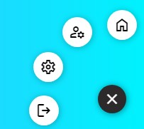
Corner Menu
There you go! I have provided also the complete source code zip file on this website and it is free to download. The download button is located below this tutorial's content. Feel free to download and modify the source code to do some experiments.
That's it! I hope this Creating a Pop-out Corner Menu using HTML, CSS, and JS Tutorial will help you with what you are looking for and will be helpful for your current and future web application projects.
Explore more on this website for more Tutorials and Free Source Codes.