Creating a Responsive Custom Admin Template using HTML, CSS, JS, and Bootstrap 5.3
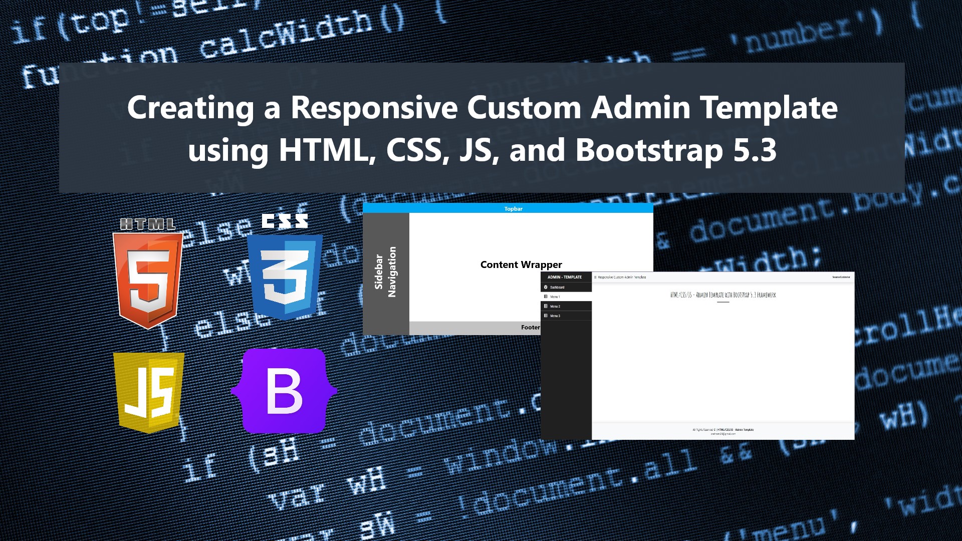
In this tutorial, I will show you how to create a Simple and Responsive Admin Template using HTML, CSS, JavaScript, and Bootstrap 5.3 Framework. The purpose of this tutorial is to provide the students, self-learners, and beginners with a reference to learn how to build a simple and responsive template using the said languages and CSS Framework. Here, snippets and source codes of a sample web application page that demonstrates a Responsive Admin Template are provided. The source code is also provided on this site and it is free to download.
What is Admin Template?
Admin Template is a collection of page interface components created using HTML, CSS, JavaScript, and any CSS and JavaScript Libraries. This template is commonly used in a web application that contains multiple features such as the admin or management site of a content management system. Developers used this type of template as the user interface to help their users to navigate to site pages easily.
Creating a Simple Responsive Admin Template with Bootstrap 5.3 Framework
The below snippets and scripts are the codes that will output a web page with an Admin Template using HTML, CSS, JavaScript, and Bootstrap 5.3. The Bootstrap Framework's assets are only loaded using CDN which means an internet connection is needed to properly display the page interface.
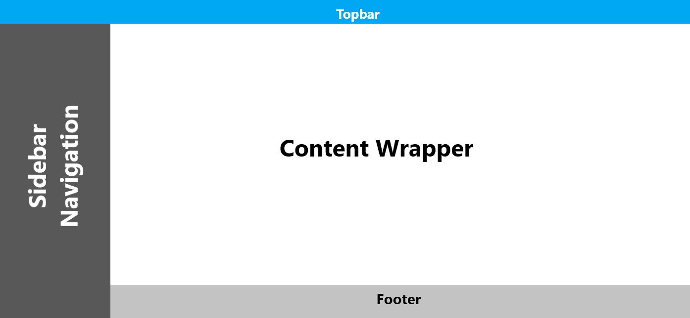
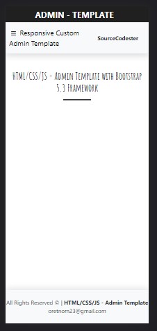
Target Template View
In this tutorial, we will create an admin template with a top bar, sidebar, footer, and content wrapper. See the following image to have a visual idea about this.
HTML
The script below is the HTML code of the web page that contains the elements we need for creating the template.
- <!DOCTYPE html>
- <html lang="en">
- <head>
- <meta charset="UTF-8">
- <meta http-equiv="X-UA-Compatible" content="IE=edge">
- <meta name="viewport" content="width=device-width, initial-scale=1.0">
- <link rel="stylesheet" href="https://cdnjs.cloudflare.com/ajax/libs/font-awesome/6.3.0/css/all.min.css" integrity="sha512-SzlrxWUlpfuzQ+pcUCosxcglQRNAq/DZjVsC0lE40xsADsfeQoEypE+enwcOiGjk/bSuGGKHEyjSoQ1zVisanQ==" crossorigin="anonymous" referrerpolicy="no-referrer" />
- <link rel="preconnect" href="https://fonts.googleapis.com">
- <link rel="preconnect" href="https://fonts.gstatic.com" crossorigin>
- <link href="https://fonts.googleapis.com/css2?family=Amatic+SC:wght@700&display=swap" rel="stylesheet">
- <link rel="stylesheet" href="https://cdn.jsdelivr.net/npm/[email protected]/dist/css/bootstrap.min.css">
- <link rel="stylesheet" href="assets/css/styles.css">
- <script src="https://cdn.jsdelivr.net/npm/[email protected]/dist/js/bootstrap.bundle.min.js"></script>
- </head>
- <body>
- <main>
- <nav class="navbar navbar-expand-lg navbar-light bg-gradient bg-light py-0 shadow" id="TopNav">
- <div id="navBarBrand-container">
- </div>
- <div id="navBarMenu-container">
- <div class="ct-top-nav-left">
- <button id="SideBarToggle">
- </button>
- <div class="collapse navbar-collapse" id="navbarNav">
- </div>
- </div>
- <div class="ct-top-nav-right">
- </div>
- </div>
- </nav>
- <div id="sidebarNav">
- <ul class="nav-menu">
- <li class="nav-item">
- <div class="nav-icon">
- </div>
- </li>
- <li class="nav-item active">
- <div class="nav-icon">
- </div>
- </li>
- <li class="nav-item">
- <div class="nav-icon">
- </div>
- </li>
- <li class="nav-item">
- <div class="nav-icon">
- </div>
- </li>
- </ul>
- </div>
- <div id="main-wrapper" class="py-5 px-3">
- <div class="container-fluid-md">
- <hr class="border-3 border-dark mx-auto opacity-100" style="width:80px">
- </div>
- </div>
- <footer class="shadow-top py-4 col-auto bg-light text-dark" id="footer">
- <div class="">
- <div class="text-center">
- </div>
- <div class="text-center">
- </div>
- </div>
- </footer>
- </main>
- </body>
- </html>
Wrapper Design
Next, let's create the CSS script for the design of the wrapper, to prevent overlays of the content on each part of the template.
- /** Font Famaily **/
- h1, h2, h3, h4, h5, h6{
- font-family: 'Amatic SC', cursive;
- }
- html, body{
- height: 100%;
- width: 100%;
- overflow-x: hidden;
- }
- /** Custom Admin Template Design **/
- /* Wrapper Design */
- main{
- width: 100%;
- height: 100%;
- overflow: hidden;
- display: flex;
- flex-direction: column;
- }
- main>nav,
- main>footer
- {
- width: 100%;
- flex-shrink: 1;
- }
- main>div#main-wrapper
- {
- width: 100%;
- flex-grow: 1;
- height: calc(100%);
- overflow: auto;
- }
Customization of Top Bar
Next, let's customize the Bootstrap navbar according to the template we want to achieve.
- /* Customizing Top bar Design */
- /* NavBar Brand */
- #navBarBrand-container{
- display: flex;
- flex-wrap: wrap;
- overflow: hidden;
- padding: 0 15px;
- justify-content: center;
- align-items: center;
- background: #202020;
- min-height: calc(100%);
- }
- #navBarBrand-container .navbar-brand{
- white-space: break-spaces;
- font-size: 1.5rem;
- font-weight: bolder;
- text-align: center;
- }
- #navBarBrand-container * {
- color:#fff;
- }
- /* Topbar title and menu container design */
- #navBarMenu-container{
- display: flex;
- align-items: center;
- justify-content: space-between;
- padding: 15px 30px 15px 10px;
- }
- #navBarMenu .ct-top-nav-left{
- width: 60%;
- }
- #navBarMenu .ct-top-nav-right{
- width: 40%;
- }
- #navBarMenu-container a{
- white-space: break-spaces;
- }
- button#SideBarToggle {
- background: transparent;
- border: unset;
- }
- button#SideBarToggle *{
- color: #2d2d2d;
- }
Creating the Sidebar Design
Next, we'll create the sidebar design. The design of the sidebar will be only simple with multiple page links that have a :hover and .active design.
- /* Sidebar Navigation */
- #sidebarNav{
- width: 350px;
- position: fixed;
- left:0;
- min-height: 60vh;
- background: #202020;
- transition: width .3s ease-in-out;
- opacity: 0;
- overflow: hidden;
- }
- #sidebarNav .nav-menu{
- width: calc(100%);
- overflow: auto;
- padding: 0;
- }
- #sidebarNav .nav-menu .nav-item:nth-child(1) {
- border-top: 2px solid #505050;
- }
- #sidebarNav .nav-menu .nav-item {
- min-height: 55px;
- display: flex;
- list-style: none;
- padding: 0 10px;
- align-items: center;
- border-bottom: 1px solid #505050;
- }
- #sidebarNav .nav-menu .nav-item:hover {
- background: #363636;
- }
- #sidebarNav .nav-menu .nav-item.active {
- background: #fff;
- }
- #sidebarNav .nav-menu .nav-item>.nav-icon {
- flex-shrink: 1;
- font-size: 23px;
- display: flex;
- align-items: center;
- justify-content: center;
- width: 60px;
- }
- #sidebarNav .nav-menu .nav-item>.nav-link {
- flex-grow: 1;
- font-size: 1.2rem;
- font-weight: 600;
- }
- #sidebarNav .nav-menu .nav-item>.nav-link,
- #sidebarNav .nav-menu .nav-item>.nav-icon
- {
- color: #ededed;
- }
- #sidebarNav .nav-menu .nav-item.active * {
- color: #363636;
- }
Footer and Transition
Next, add the additional CSS script for the design of the footer and the transition of the panel.
- footer#footer {
- box-shadow: 0px 0px 22px #d7d7d7;
- }
- #main-wrapper,
- #navBarMenu-container,
- #navBarBrand-container,
- #footer{
- transition: width .3s ease-in-out, margin .3s ease-in-out;
- }
Tablet and Mobile View Design
Next, create the script that overwrites some of the provided CSS scripts for devices with a smaller screen such as tablets and mobile devices.
- /* Customize Admin Template in Tablets, mobile, and smaller screens */
- @media (max-width:768px){
- #TopNav{
- display: flex;
- height: auto;
- }
- #navBarBrand-container,
- #navBarMenu-container,
- #footer
- {
- width: 100% !important;
- }
- #navBarBrand-container{
- min-height: unset;
- }
- #sidebarNav{
- z-index: 99;
- box-shadow: 0px 2px 5px #000;
- }
- #sidebarNav .nav-menu .nav-item.active {
- border-top-left-radius: unset;
- border-bottom-left-radius: unset;
- background: #fff;
- }
- }
- @media (max-width:350px){
- #sidebarNav{
- width: 100%;
- }
- }
Creating the JavaScript
Lastly, let's create the scripts that will help the page interface be more responsive to any device screen resolutions, when the window screen is resized, and when the document is loaded successfully. Make sure to load this script on the HTML file.
- const customTopBar = document.getElementById("TopNav")
- const customSideBar = document.getElementById("sidebarNav")
- const customFooter = document.getElementById("footer")
- const NavBarBrand = document.getElementById("navBarBrand-container")
- const NavBarMenu = document.getElementById("navBarMenu-container")
- const MainWrapper = document.getElementById("main-wrapper")
- const SideBarToggle = document.getElementById("SideBarToggle")
- var SideBarwidth = customSideBar.clientWidth
- window.cusotmAdminTemplate = function(){
- var sb_is_toggle = !!SideBarToggle.getAttribute('data-toggle') && SideBarToggle.getAttribute('data-toggle') == "true";
- if(sb_is_toggle){
- customSideBar.style.width = 0;
- customFooter.style.width = (window.innerWidth) + `px`;
- customFooter.style.marginLeft = `0px`;
- MainWrapper.style.width =(window.innerWidth) + `px`;
- MainWrapper.style.marginLeft = `0px`;
- // For laptop, desktop, or bigger screens only
- if(window.innerWidth > 768)
- NavBarBrand.style.width = `auto`;
- }else{
- if(window.innerWidth > 768){
- // For laptop, desktop, or bigger screens only
- if(customSideBar.clientWidth == 0)
- customSideBar.style.width = SideBarwidth + `px`;
- customSideBar.style.height = (window.innerHeight - customTopBar.clientHeight) + `px`;
- customSideBar.style.marginTop = (customTopBar.clientHeight) + `px`;
- customFooter.style.width = (window.innerWidth - SideBarwidth) + `px`;
- customFooter.style.marginLeft = (SideBarwidth) + `px`;
- NavBarBrand.style.width = SideBarwidth + `px`;
- NavBarMenu.style.width =(window.innerWidth - SideBarwidth) + `px`;
- MainWrapper.style.width =(window.innerWidth - SideBarwidth) + `px`;
- MainWrapper.style.marginLeft = (SideBarwidth) + `px`;
- }else{
- // For mobile, tablets, or smaller screens only
- if(customSideBar.clientWidth == 0)
- customSideBar.style.width = SideBarwidth + `px`;
- customFooter.style.width = (window.innerWidth) + `px`;
- customFooter.style.marginLeft = `0px`;
- MainWrapper.style.width =(window.innerWidth) + `px`;
- MainWrapper.style.marginLeft = `0px`;
- customSideBar.style.height = (window.innerHeight - customTopBar.clientHeight) + `px`;
- customSideBar.style.marginTop = (customTopBar.clientHeight) + `px`;
- }
- }
- }
- cusotmAdminTemplate();
- window.onload = function(){
- cusotmAdminTemplate();
- // hide sidebar as default for smaller screens
- if(window.innerWidth <= 768){
- SideBarToggle.setAttribute('data-toggle', "true")
- customSideBar.style.width = `0px`;
- }
- // enable the sidebar vissibility
- setTimeout(function(){
- customSideBar.style.opacity = '1'
- }, 300)
- }
- /** Update containers sizes when resizing the window screen */
- window.onresize = function(){
- cusotmAdminTemplate();
- }
- /**
- * Toggle SideBar
- */
- SideBarToggle.addEventListener('click', function(){
- if(!!SideBarToggle.getAttribute('data-toggle') && SideBarToggle.getAttribute('data-toggle') == "true"){
- SideBarToggle.setAttribute('data-toggle', "false")
- }else{
- SideBarToggle.setAttribute('data-toggle', "true")
- }
- cusotmAdminTemplate();
- })
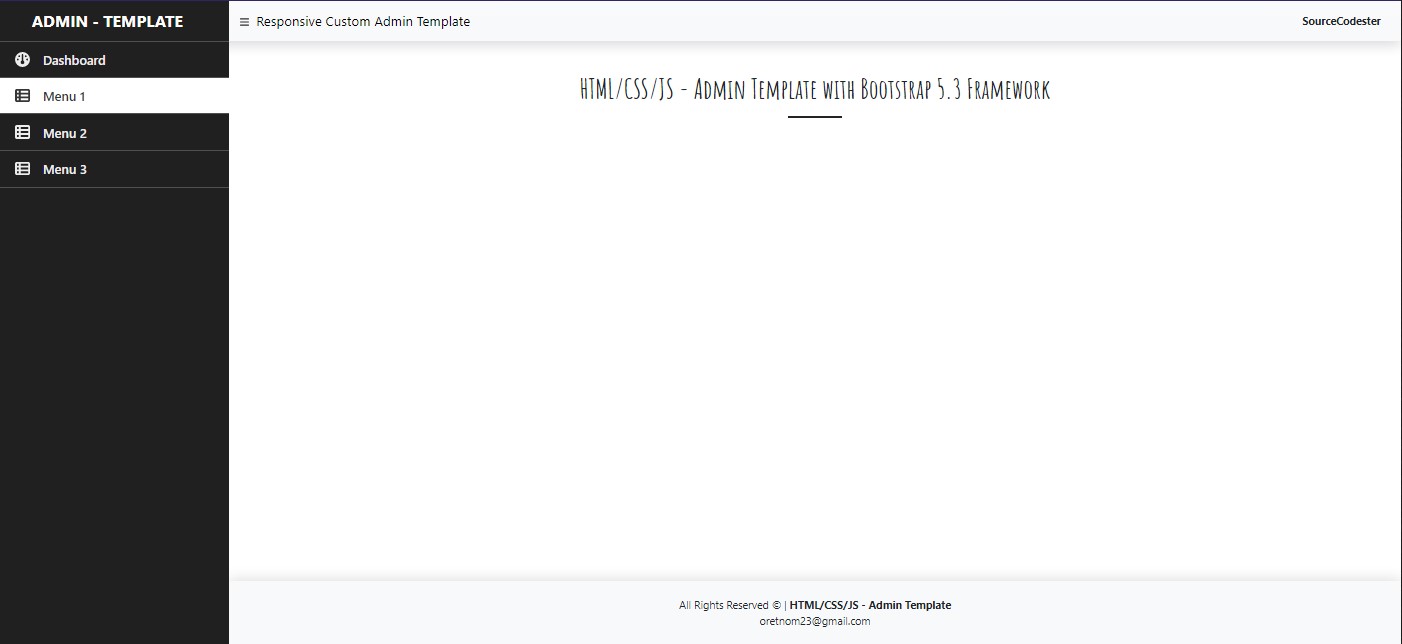
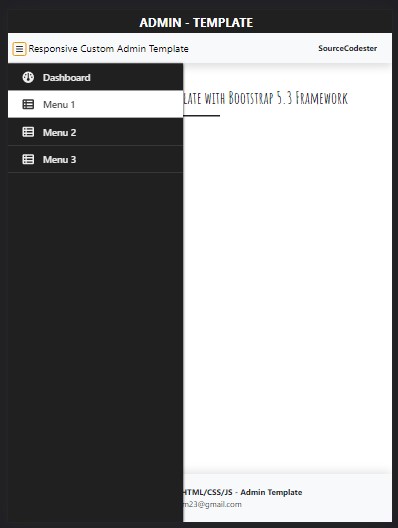
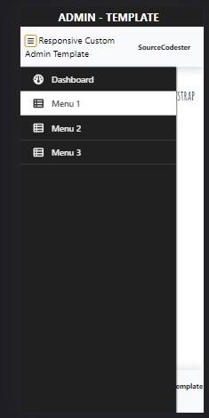
Output
Here are the snapshots of the result of the page interface with an Admin Template.
Desktop, Laptop, and Bigger Screen Devices
Tablet Device (Portrait)
Mobile Device (hidden sidebar)
Mobile Device (sidebar toggled)
There you go! I have also provided the complete source code zip file that I created for this tutorial on this site and it is free to download. The download button is located below this tutorial's content. Feel free to download and modify it the way you wanted.
That's the end of this tutorial! I hope this Creating a Responsive Custom Admin Template using HTML, CSS, JS, and Bootstrap 5.3 Tutorial will help you with what you are looking for and will be useful for your current and future web application projects.
Explore more on this website for more Tutorials and Free Source Codes.