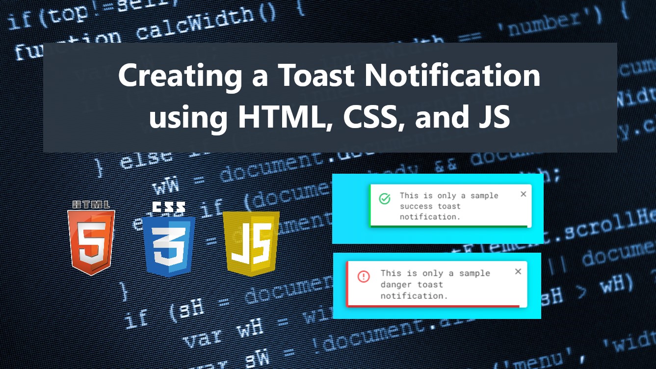
Creating a Custom Toast Notification using HTML, CSS, and JS Tutorial
In this tutorial, you can learn to create a custom and simple Toast Notification using HTML, CSS, and Pure JavaScript. The tutorial aims to provide students and beginners with a reference for learning to build a popup message box for websites or web applications. Here, I will be providing a sample web page script that demonstrates the creation of a simple Toast Notification.
What is Toast Notification?
The Toast Notification is one of the most common components or web features of a website or web application nowadays. It is a Popup or Overlay message or notification that often comes with some icons and a progress bar for the duration of showing the notification. This component is usually implemented by developers to provide better and more interactive web features.
How to Create a Toast Notification
The Toast Notification can be achieved easily using some HTML elements, CSS properties, and JavaScript event listeners and methods. We can simply create the Toast Box with some HTML Elements such as the div tag and design it with the CSS and put some animation to make it more interactive. Then, using JavaScript we can create a class or function that we can make the toast notification reusable and easy to initialize. Check out the source code scripts that I created and provided below to understand it more.
Sample Web Page Scripts
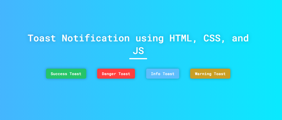
The following scripts result in a simple web page that contains 4 different buttons. Each button triggers to show a toast notification. The toast notification has 4 different types which are the success, danger, info, and warning toast notification. Each type has a specific icon.
Page Interface
Here's the HTML file script known as index.html. The file contains the page layout and button elements.
- <!DOCTYPE html>
- <html lang="en">
- <head>
- <meta charset="UTF-8">
- <meta name="viewport" content="width=device-width, initial-scale=1.0">
- <link rel="stylesheet" href="style.css">
- <link rel="stylesheet" href="customToast.css">
- <link rel="preconnect" href="https://fonts.googleapis.com">
- <link rel="preconnect" href="https://fonts.gstatic.com" crossorigin>
- <link rel="stylesheet" href="https://fonts.googleapis.com/css2?family=Material+Symbols+Outlined:opsz,wght,FILL,[email protected],100..700,0..1,-50..200" />
- </head>
- <body>
- <!-- <div class="toast toast-warning">
- <button class="toast-close-btn"><span class="material-symbols-outlined">close</span></button>
- <div class="toast-content-wrapper">
- <div class="toast-icon">
- <span class="material-symbols-outlined">task_alt</span>
- </div>
- <div class="toast-message">Sample success toast message.</div>
- <div class="toast-progress"></div>
- </div>
- </div> -->
- <div class="container">
- <hr id="title_hr">
- <div class="btn-wrapper">
- </div>
- </div>
- </body>
- </html>
Default Stylesheet
Next, here's the default CSS file script known as style.css. The file contains the page layout design stylesheet.
- @import url('https://fonts.googleapis.com/css2?family=Dongle:wght@300;400;700&family=Roboto+Mono:ital,wght@0,100;0,200;0,300;0,400;0,500;0,600;1,100;1,200;1,300;1,400;1,500;1,600&display=swap" rel="stylesheet');
- *{
- margin: 0;
- padding: 0;
- box-sizing: border-box;
- font-family: 'Dongle', sans-serif;
- font-family: 'Roboto Mono', monospace;
- }
- ::selection{
- color: #fff;
- background: #4db2ec;
- }
- body{
- display: flex;
- align-items: center;
- justify-content: center;
- min-height: 100vh;
- background: #4facfe;
- background-image: linear-gradient(to right, #4facfe 0%, #00f2fe 100%);
- padding: 2em 0;
- }
- #page-title{
- color: #fff;
- text-align: center;
- font-weight: 500;
- text-shadow: 0px 0px 15px #0000003a;
- }
- #title_hr{
- width:60px;
- border: 2px solid #ffffff;
- margin: .35em auto;
- }
- @media (min-width: 780px){
- #page-title{
- width: 780px;
- }
- }
- .btn-wrapper{
- width: 680px;
- display: flex;
- flex-wrap:wrap;
- justify-content: space-evenly;
- grid-gap:10px;
- margin:2em auto;
- }
- @media (max-width:700px){
- .btn-wrapper{
- width: 95%;
- }
- }
- button.btn-toast {
- padding: 0.5rem 1rem;
- border: none;
- background: #000;
- color: #fff;
- font-weight: 500;
- border-radius: 5px;
- box-shadow: 0px 0px 10px #0000004a;
- cursor: pointer;
- }
- button.btn-toast:hover{
- filter:brightness(.9);
- }
- button.btn-success-toast{
- background-color:#26c468;
- }
- button.btn-warning-toast{
- background-color:#c99e25;
- }
- button.btn-info-toast{
- background-color:#5fbdfc;
- }
- button.btn-danger-toast{
- background-color:#ff3f3f;
- }
Toast Notification Stylesheet
Next, here's the CSS file script known as customToast.css. The file contains the stylesheet codes for the toast notification box and its child elements.
- /**
- * Custom Simple Toast Stylesheet
- * Developed by: oretnom23
- * Please load this file with the CustomToast.js file and Google Icons
- */
- .toast {
- position: fixed;
- top: 25px;
- right: 25px;
- width: 300px;
- background: #fff;
- padding: 0.5em 0.35em;
- border-left: 4px solid #b7b7b7;
- border-radius: 4px;
- box-shadow: -1px 1px 10px #00000057;
- z-index: 1023;
- animation: leftToRight .5s ease-in-out forwards;
- transform: translateX(110%);
- }
- .toast.closing{
- animation: RightToLeft .5s ease-in-out forwards;
- }
- .toast-progress {
- position: absolute;
- display: block;
- bottom: 0;
- left: 0;
- height: 4px;
- width: 100%;
- background: #b7b7b7;
- animation: Toastprogress 3s ease-in-out forwards;
- }
- @keyframes leftToRight {
- 0%{
- transform: translateX(110%);
- }
- 75%{
- transform: translateX(-10%);
- }
- 100%{
- transform: translateX(0%);
- }
- }
- @keyframes RightToLeft {
- 0%{
- transform: translateX(0%);
- }
- 25%{
- transform: translateX(-10%);
- }
- 100%{
- transform: translateX(110%);
- }
- }
- @keyframes Toastprogress {
- 0%{
- width: 100%;
- }
- 100%{
- width: 0%;
- }
- }
- button.toast-close-btn {
- outline: none;
- background: none;
- border: none;
- float: right;
- cursor: pointer;
- }
- button.toast-close-btn>span,
- button.toast-close-btn>i{
- font-size:1.2rem;
- color:#747474;
- font-weight: 500;
- }
- button.toast-close-btn:hover>span,
- button.toast-close-btn:hover>i{
- color:#585858;
- }
- .toast-content-wrapper {
- display: flex;
- /* margin-top: 1rem; */
- justify-content: space-evenly;
- align-items: start;
- }
- .toast-icon {
- padding: 0.35rem 0.5rem;
- }
- .toast-message {
- font-size: .9rem;
- color: #424242;
- padding: 0.15rem 0.5rem;
- }
- /* success toast */
- .toast.toast-success{
- border-color: #03e05f;
- }
- .toast.toast-success .toast-progress{
- background-color: #088d3f;
- }
- .toast.toast-success .toast-icon>span,
- .toast.toast-success .toast-icon>i{
- color: #26c468;
- }
- /* danger toast */
- .toast.toast-danger{
- border-color: #ff3f3f;
- }
- .toast.toast-danger .toast-progress{
- background-color: #d63030;
- }
- .toast.toast-danger .toast-icon>span,
- .toast.toast-danger .toast-icon>i{
- color: #ff3f3f;
- }
- /* info toast */
- .toast.toast-info{
- border-color: #5fbdfc;
- }
- .toast.toast-info .toast-progress{
- background-color: #4b9fd8;
- }
- .toast.toast-info .toast-icon>span,
- .toast.toast-info .toast-icon>i{
- color: #5fbdfc;
- }
- /* warning toast */
- .toast.toast-warning{
- border-color: #c99e25;
- }
- .toast.toast-warning .toast-progress{
- background-color: #bb9223;
- }
- .toast.toast-warning .toast-icon>span,
- .toast.toast-warning .toast-icon>i{
- color: #c99e25;
- }
Toast Notification Script
Next, here's the JavaScript file script known as customToast.js. The file contains the toast notification class and object.
- /**
- * Custom Simple Toast Class
- * Developed by: oretnom23
- * Please load this file with the CustomToast.css file and Google Icons
- */
- class CustomToast{
- // Toast Box variable
- toastBox;
- // Toast Box Duration variable
- duration;
- // Valid Toast Icons
- toastIcon = {
- success: `<span class="material-symbols-outlined">task_alt</span>`,
- danger: `<span class="material-symbols-outlined">error</span>`,
- warning: `<span class="material-symbols-outlined">warning</span>`,
- info: `<span class="material-symbols-outlined">info</span>`
- };
- show(message="Sample Message", toastType="info", duration = 5000){
- // Check if toast type is valid, otherwise make info toast as the default
- if(!Object.keys(this.toastIcon).includes(toastType))
- toastType = `info`;
- // Creatign the Toast Box Element
- this.toastBox = document.createElement('div')
- // Adding .toast class to Toast Box Element
- this.toastBox.classList.add('toast', `toast-${toastType}`)
- // Toast box content
- this.toastBox.innerHTML = `<button class="toast-close-btn"><span class="material-symbols-outlined">close</span></button>
- <div class="toast-content-wrapper">
- <div class="toast-icon">
- ${this.toastIcon[toastType]}
- </div>
- <div class="toast-message">${message}</div>
- <div class="toast-progress"></div>
- </div>`;
- // Set Toast Duration
- this.duration = duration
- // Update Toast Duration
- this.toastBox.querySelector('.toast-progress').style.animationDuration = `${this.duration / 1000}s`
- // Remove Current Toast Notification if Exists
- if(document.body.querySelector('.toast') != null)
- document.body.querySelector('.toast').remove();
- // Append New Toast Notification to the document
- document.body.appendChild(this.toastBox)
- // Trigger closing duration
- this.triggerClose()
- // When Close Icon/Button is clicked event listener
- this.toastBox.querySelector('.toast-close-btn').addEventListener('click', e=>{
- e.preventDefault()
- // Trigger immediate closing
- this.triggerClose(0)
- })
- }
- triggerClose(closeDuration = null){
- // Set toast duration as the closing delay if the closing duration value is null
- if(closeDuration == null){
- closeDuration=this.duration
- }
- setTimeout(()=>{
- // adding closing class for closing animation
- this.toastBox.classList.add('closing')
- // trigger removing the toast notification
- this.closeToast()
- },closeDuration)
- }
- closeToast(){
- // Set removing toast delay
- setTimeout(()=>{
- this.toastBox.remove();
- }, 500)
- }
- }
Buttons Action Scripts
Finally, here's the JavaScript file script known as script.js. The file contains the codes that make the buttons functional which are triggering the toast notifications to show.
- const successToast = document.querySelector('.btn-toast.btn-success-toast')
- const infoToast = document.querySelector('.btn-toast.btn-info-toast')
- const dangerToast = document.querySelector('.btn-toast.btn-danger-toast')
- const warningToast = document.querySelector('.btn-toast.btn-warning-toast')
- successToast.addEventListener('click', e=>{
- e.preventDefault()
- new CustomToast().show(`This is only a sample success toast notification.`, 'success', 10000)
- })
- infoToast.addEventListener('click', e=>{
- e.preventDefault()
- new CustomToast().show(`This is only a sample info toast notification.`, 'info', 10000)
- })
- dangerToast.addEventListener('click', e=>{
- e.preventDefault()
- new CustomToast().show(`This is only a sample danger toast notification.`, 'danger', 10000)
- })
- warningToast.addEventListener('click', e=>{
- e.preventDefault()
- new CustomToast().show(`This is only a sample warning toast notification.`, 'warning', 10000)
- })
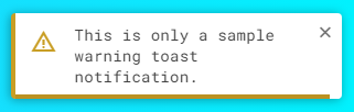
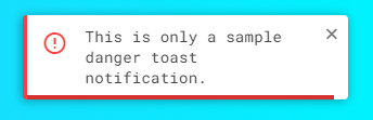
Snapshots
Here are some snapshots of the overall result of the web page script I have provided above:
Page UI
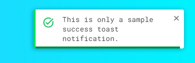
Success Toast
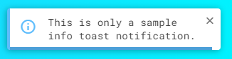
Info Toast
Warning Toast
Danger Toast
There you go! I have also provided the complete source code zip file of the scripts that I provided on this site and it is free to download. The download button can be found below this tutorial's content. Feel free to download and modify the source code the way you wanted.
DEMO VIDEO
You can also use the Toast Notification JS Class that I created for your own projects. Just copy and load the customToast.css and customToast.js. Note that this Toast notification is using Google Icons which means you have to load also the Google Icons asset.
That's it! I hope this Creating a Custom Toast Notification using HTML, CSS, and JS Tutorial will help you with what you are looking for and you'll find it useful for your current and future web application projects.
Explore more on this website for more Tutorials and Free Source Codes.