Creating an Infinity Loader using HTML and CSS Tutorial
In this tutorial, you can learn how to create a simple Infinity Loader using HTML and CSS. The main purpose of this tutorial is to provide the students and beginners with a reference for understanding how the animated loader is made using CSS only, Here, I will be providing a script that demonstrates the infinity loader using only CSS and HTML.
What is a loader?
In a web application, website, or computer software, the loader or also known as the preloader is what the user sees before the window or the page document has loaded successfully. It is often simple or complex animations that are used to keep visitors entertained while server operations finish processing.
How to Create Infinity Loader?
There are lots of different amazing preloaders design that we can use for our web applications or websites. Infinity Loader Design is one of the common preloaders that is being used for most sites. To create one, we can simply use some HTML elements and add some CSS styles and animation to achieve it.
Here is the following script that demonstrates the creation of a simple Infinity Loader.
HTML
First, we'll need to create the web page for the loader container and elements.
- <!DOCTYPE html>
- <html lang="en">
- <head>
- <meta charset="UTF-8">
- <meta http-equiv="X-UA-Compatible" content="IE=edge">
- <meta name="viewport" content="width=device-width, initial-scale=1.0">
- <link rel="preconnect" href="https://fonts.googleapis.com">
- <link rel="preconnect" href="https://fonts.gstatic.com" crossorigin>
- <link href="https://fonts.googleapis.com/css2?family=Mynerve&display=swap" rel="stylesheet">
- <link rel="stylesheet" href="style.css">
- </head>
- <body>
- <section>
- <hr width="50px">
- <!-- Infinity Loader Container -->
- <div class="infitiny-loader">
- <div class="circle">
- </div>
- <div class="circle">
- </div>
- </div>
- <!-- End of Infinity Loader Container -->
- </section>
- </body>
- </html>
Web-Page CSS
Next, let's create the web page design and the infinity symbol.
- /*
- * Web Page Design
- */
- :root{
- --mynerve-font:'Mynerve', cursive;
- --light-color:#f9f9f9;
- --dark-color:#20262E;
- }
- body,
- html{
- height: 100%;
- width: 100%;
- }
- h1{
- font-family: var(--mynerve-font)
- }
- .text-center{
- text-align: center;
- }
- html{
- overflow: hidden;
- }
- body{
- background-color: var(--dark-color);
- color:var(--light-color);
- overflow:auto;
- margin: 0;
- padding: 0;
- }
- section{
- padding-top: 20vh;
- width: calc(100%);
- display: flex;
- flex-direction: column;
- align-items: center;
- justify-content: center;
- }
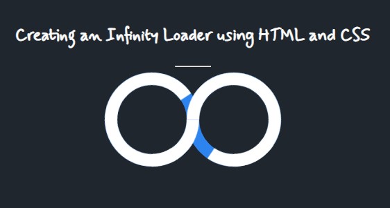
Here's the result of the script above.

Loader CSS
Lastly, let's create the animation and the design of the infinity loader.
- /**
- * Infitiy Loader styles
- */
- .infitiny-loader {
- width: 100%;
- display: flex;
- align-items: center;
- justify-content: center;
- }
- .circle {
- position: relative;
- height: 100px;
- width: 100px;
- border: 18px solid #2d84ee;
- border-radius: 100px;
- margin: 0 -9px;
- }
- /*
- * Span
- */
- .circle span {
- content: "";
- position: absolute;
- height: 100px;
- width: 100px;
- border: 18px solid transparent;
- border-radius: 100px;
- top: -18px;
- left: -18px;
- transform: rotate(135deg);
- z-index: 99;
- border-top-color: #fff;
- animation: spin 6s cubic-bezier(0, 0, 0, 0) infinite;
- animation-delay: 0s;
- }
- .circle span:nth-child(2) {
- transform: rotate(135deg);
- border-color: #fff;
- border-top-color: transparent;
- animation: spinn 6s cubic-bezier(0, 0, 0, 0) infinite .75s;
- }
- .circle:nth-child(2) span:nth-child(1) {
- animation: spin2 6s cubic-bezier(0, 0, 0, 0) infinite 3s;
- transform: rotate(225deg);
- }
- .circle:nth-child(2) span:nth-child(2) {
- animation: spinn2 6s cubic-bezier(0, 0, 0, 0) infinite 3.75s;
- transform: rotate(225deg);
- border-color: #fff;
- border-top-color: transparent;
- }
- /*
- * Animation
- */
- @keyframes spin {
- 0%{
- transform: rotate(135deg);
- }
- 50%,100%{
- transform: rotate(495deg);
- }
- }
- @keyframes spinn {
- 0%{
- transform: rotate(135deg);
- }
- 50%, 100%{
- transform: rotate(495deg);
- }
- }
- @keyframes spin2 {
- 0%{
- transform: rotate(225deg);
- }
- 50%,100%{
- transform: rotate(-135deg);
- }
- }
- @keyframes spinn2 {
- 0%{
- transform: rotate(225deg);
- }
- 50%,100%{
- transform: rotate(-135deg);
- }
- }
Here's the result of the script above.
There you go! I hope this Creating an Infinity Loader using HTML and CSS Tutorial will help you with what you are looking for and will be helpful for current and future web application projects.
Explore more on this website for more Tutorials and Free Source Codes.