Media Rule in CSS
Submitted by GeePee on Sunday, January 18, 2015 - 22:23.
Language
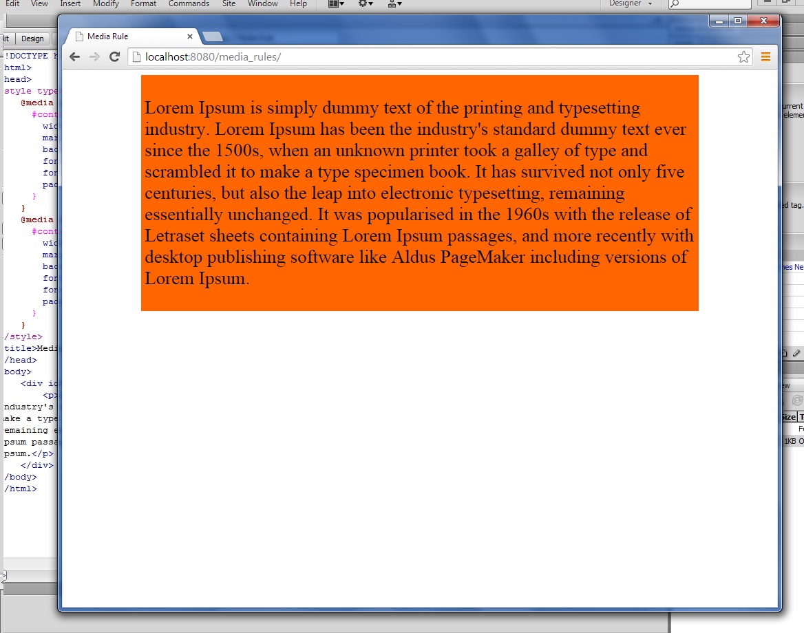
This project will teach you how to use media rule in css. @media rule allows different style or layout for different media in the same style sheet.
I have here in my example a box with a content. You can see the changes of the page content when the user resized the screen(box color and font-size change according to screen size).
Hope you learn from this.
Note: Due to the size or complexity of this submission, the author has submitted it as a .zip file to shorten your download time. After downloading it, you will need a program like Winzip to decompress it.
Virus note: All files are scanned once-a-day by SourceCodester.com for viruses, but new viruses come out every day, so no prevention program can catch 100% of them.
FOR YOUR OWN SAFETY, PLEASE:
1. Re-scan downloaded files using your personal virus checker before using it.
2. NEVER, EVER run compiled files (.exe's, .ocx's, .dll's etc.)--only run source code.