Animation Timing Function in CSS3
Submitted by alpha_luna on Wednesday, May 6, 2015 - 23:33.
Good day!
In this tutorial, we are going to learn about animation-timing-function. What is animation-timing-function? animation-timing-function property specifies the speed curve of the animation. The speed curve defines the amount of time an animation uses to change from one set of CSS styles to another. Syntax of this property:animation-timing-function: linear | ease | ease-in | ease-out | ease-in-out | cubic-bezier (n,n,n,n) | initial | inherit ;
Property Values
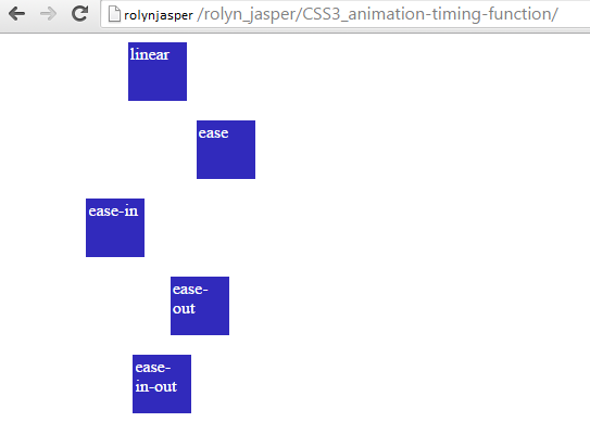
linear - specifies that the animation has the same speed from start to end.
ease - specifies that the animation starts slowly, then fast, then ends slowly. (The default value of this property is ease).
ease-in - specifies that the animation starts slowly.
ease-out - specifies that the animation ends slowly.
ease-in-out - specifies that the animation starts and ends slowly.
cubic-bezier (n,n,n,n) - allows specification of values in the cubic-bezier function. Possible values are numeric values from 0 to 1.
initial - specifies that the value of the property should be set to the default value.
inherit - specifies that the value of the property should be inherited from the parent element.
Example
This example shows the use of the animation-timing-function property.
CSS3 animation-timing-function
linear
ease
ease-in
ease-out
ease-in-out
This is the result of the code above:
