Simple Analog Clock Using HTML/CSS

Language

Analog Clock Using HTML/CSS

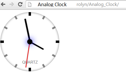
This is a simple analog clock created using HTML and CSS3 only, with no images involved. As such, you can easily customize the size of the clock and its colors etc. The analog clock works in IE9+ and all versions of other browsers, including on mobile. Hope this work will help you in your project.

HTML Source Code

  1. <div id="liveclock" class="outer_face">
  2. <div class="marker oneseven"></div>
  3. <div class="marker twoeight"></div>
  4. <div class="marker fourten"></div>
  5. <div class="marker fiveeleven"></div>
  6.  
  7. <div class="inner_face">
  8. <div class="hand hour"></div>
  9. <div class="hand minute"></div>
  10. <div class="hand second"></div>
  11. </div>
  12. </div>

CSS Style

  1. .outer_face {
  2. position: relative;
  3. width: 200px; /* width of clock */
  4. height: 200px; /* height of clock */
  5. border-radius: 200px; /* clock round corner radius */
  6. background: white;
  7. box-shadow: inset 0 0 10px gray;
  8. border: 0 solid gray; /* thickness of outer border */
  9. }
  10.  
  11. .outer_face::before, .outer_face::after, .outer_face .marker { /* time markers syle */
  12. content: "";
  13. position: absolute;
  14. width: 8px; /* width of 12-6 and 3-9 markers */
  15. height: 100%;
  16. background: black;
  17. z-index: 0;
  18. left: 50%;
  19. margin-left: -4px; /* set this value of 1/2 marker width */
  20. top: 0
  21. }
  22.  
  23. .outer_face::after {
  24. -moz-transform: rotate(90deg);
  25. -ms-transform: rotate(90deg);
  26. -webkit-transform: rotate(90deg);
  27. transform: rotate(90deg)
  28. }
  29.  
  30. .outer_face .marker {
  31. background: gray;
  32. width: 6px; /* width of all other markers */
  33. margin-left: -3px /* set this value of 1/2 marker width */
  34. }
  35.  
  36. .outer_face .marker.oneseven {
  37. -moz-transform: rotate(30deg);
  38. -ms-transform: rotate(30deg);
  39. -webkit-transform: rotate(30deg);
  40. transform: rotate(30deg)
  41. }
  42.  
  43. .outer_face .marker.twoeight {
  44. -moz-transform: rotate(60deg);
  45. -ms-transform: rotate(60deg);
  46. -webkit-transform: rotate(60deg);
  47. transform: rotate(60deg)
  48. }
  49.  
  50. .outer_face .marker.fourten {
  51. -moz-transform: rotate(120deg);
  52. -ms-transform: rotate(120deg);
  53. -webkit-transform: rotate(120deg);
  54. transform: rotate(120deg)
  55. }
  56.  
  57. .outer_face .marker.fiveeleven {
  58. -moz-transform: rotate(150deg);
  59. -ms-transform: rotate(150deg);
  60. -webkit-transform: rotate(150deg);
  61. transform: rotate(150deg)
  62. }
  63.  
  64. .inner_face {
  65. position: relative;
  66. width: 88%;
  67. height: 88%;
  68. background: white;
  69. -moz-border-radius: 1000px;
  70. -webkit-border-radius: 1000px;
  71. border-radius: 1000px;
  72. z-index: 1000;
  73. left: 6%; /* set this value of 1/2 width value*/
  74. top: 6% /* set this value of 1/2 height value*/
  75. }
  76.  
  77. .inner_face::before {
  78. /* clock center circle small */
  79. content: "";
  80. width: 18px; /* width of inner circle */
  81. height: 18px; /* height of inner circle */
  82. border-radius: 18px;
  83. margin-left: -9px; /* set this value of 1/2 width value*/
  84. margin-top: -9px; /* set this value of 1/2 height value*/
  85. background: black;
  86. position: absolute;
  87. top: 50%;
  88. left: 50%;
  89. box-shadow: 0 0 30px blue;
  90. }
  91.  
  92. .inner_face::after {
  93. content: "QUARTZ";
  94. position: absolute;
  95. width: 100%;
  96. font: normal 0.8em Arial;
  97. color: gray;
  98. text-align: center;
  99. top: 85%
  100. }
  101.  
  102. .hand, .hand.hour {
  103. position: absolute;
  104. width: 4px; /* width of hour hand */
  105. height: 30%; /* height of hour hand */
  106. top: 20%; /* set top to 50% - height */
  107. left: 50%;
  108. margin-left: -2px; /* set this value to 1/2 width */
  109. background: black;
  110. -moz-transform: rotate(0deg);
  111. -ms-transform: rotate(0deg);
  112. -webkit-transform: rotate(0deg);
  113. transform: rotate(0deg);
  114. -moz-transform-origin: bottom;
  115. -ms-transform-origin: bottom;
  116. -webkit-transform-origin: bottom;
  117. transform-origin: bottom;
  118. z-index: -1;
  119. -moz-box-shadow: 0 0 3px gray;
  120. -webkit-box-shadow: 0 0 3px gray;
  121. box-shadow: 0 0 3px gray
  122. }
  123.  
  124. .hand.minute {
  125. height: 45%; /* height of min hand */
  126. top: 5%; /* set top to 50% - height */
  127. width: 5px; /* width of min hand */
  128. margin-left: -2.5px; /* set this value to 1/2 width */
  129. }
  130.  
  131. .hand.second {
  132. height: 50%; /* height of sec hand */
  133. width: 2px; /* width of sec hand */
  134. margin-left: -1px; /* set this value to 1/2 width */
  135. top: 0;
  136. background: red
  137. }

Result:

Result And, that's all, you can use this to put in your program. Share us your thoughts and comments below. Thank you so much for dropping by and reading this tutorial post. For more updates, don’t hesitate and feel free to visit this website more often and please share this with your friends or email me at [email protected]. Practice Coding. Thank you very much.

Note: Due to the size or complexity of this submission, the author has submitted it as a .zip file to shorten your download time. After downloading it, you will need a program like Winzip to decompress it.

Virus note: All files are scanned once-a-day by SourceCodester.com for viruses, but new viruses come out every day, so no prevention program can catch 100% of them.

FOR YOUR OWN SAFETY, PLEASE:

1. Re-scan downloaded files using your personal virus checker before using it.
2. NEVER, EVER run compiled files (.exe's, .ocx's, .dll's etc.)--only run source code.

Add new comment