CSS @keyframes Rule
Submitted by alpha_luna on Tuesday, June 21, 2016 - 16:34.
Language
What is a @keyframes in CSS3?
The @keyframes rule is used to create animations. In general, an animation in CSS3 is defined as changing from one CSS style to another.
Structure:
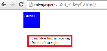
This is the result of the code above:
 Hope that this tutorial will help you a lot.
So what can you say about this work? Share your thoughts in the comment section below or email me at [email protected]. Practice Coding. Thank you very much.
Hope that this tutorial will help you a lot.
So what can you say about this work? Share your thoughts in the comment section below or email me at [email protected]. Practice Coding. Thank you very much.
@keyframes name { selector { styles ; } }
Property Values:
name – it’s specifies the name of the animation. (required)
selector – it’s specifies that percentage of the animation duration.(required)
Possible Value:
0 – 100%
from (same as 0%)
to (same as 100%)
styles - it’s specifies one or more CSS style properties.(required)
Example:
In this example you can see on how to use @keyframes rule to animate the position of a box.
CSS Source Code
Full Source Code
Hope that this tutorial will help you a lot.
So what can you say about this work? Share your thoughts in the comment section below or email me at [email protected]. Practice Coding. Thank you very much.Note: Due to the size or complexity of this submission, the author has submitted it as a .zip file to shorten your download time. After downloading it, you will need a program like Winzip to decompress it.
Virus note: All files are scanned once-a-day by SourceCodester.com for viruses, but new viruses come out every day, so no prevention program can catch 100% of them.
FOR YOUR OWN SAFETY, PLEASE:
1. Re-scan downloaded files using your personal virus checker before using it.
2. NEVER, EVER run compiled files (.exe's, .ocx's, .dll's etc.)--only run source code.
Add new comment
- 110 views